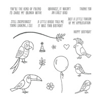
The Bird Banter stamp set is such a fun set to use. There are so many possibilities. Today I made an unusual pairing that are young at heart. I say that because of their funky hair colors !! I took quite a bit of artistic license in my color choices.
Bird Banter, 145852
Can you see the blue tipped hair on the cockatoo? I say there are no rules in our color choices, or hair styles!!
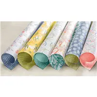
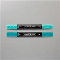
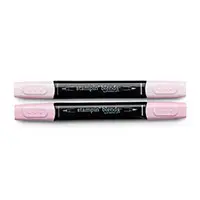
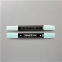
The Painted With Love Designer Series Paper is still the star of the show. It was also the color inspiration for the most part. The Pool Party was an add on. I colored with the Stampin’ Blends again. I am so in love with these pens. They are the easiest to color with. I am definitely no expert, so this shows how forgiving they are to work with.
The balloon is stamped and cut from a small scrap of Delightful Daisy Designer Series Paper. Never throw away your scraps, but especially DSP scraps. They are perfect for small accents.
This is a 4 X 4 card that is very quick to complete. It would be great to make a set with the different birds from this set. Hhhmmm……I may have to do that. Stay tuned.
MEASUREMENTS:
Rich Razzleberry base cut 8 X 4 and folded in half
Very Vanilla layer 3 3/4 X 3 3/4
DSP layer 3 5/8 X 3 5/8
Rich Razzleberry center layer 2 5/8 X 2 5/8
Very Vanilla center layer 2 1/2 X 2 1/2
Thank you so much for visiting with me today! I hope you enjoyed this card. I would love to hear from you. And if you do not have a current Stampin’ Up! Demonstrator, I would be happy to get you the current catalogs. I would also enjoy talking with you about becoming a Stampin’ Up! Demonstrator. The next paragraph mentions some of the wonderful reasons to consider this.
Have you ever thought about becoming a Stampin’ Up! Demonstrator? During Sale-A-Bration is the perfect time to join. Not only are you getting the Ultimate Bundle ($125.00 worth of product for $99.00) but you also get to choose 2 additional stamp sets, up to $25.00 each. Additionally you will get a 20% discount on any future purchases. Or, if you are just wanting to test drive the idea, you would not need to make another purchase until July! There is no pressure for you to continue as a demonstrator. And there is no penalty if you decide not to continue. Please contact me and let’s talk about it.
LOL !!! If you are my age, you probably grew up with the “Bluebird of Happiness” not being a good thing. But that was exactly what I thought of when I saw the bird with the heart on top of the cart. And that led to part of my color scheme for this card. I am really happy with my bluebird here.
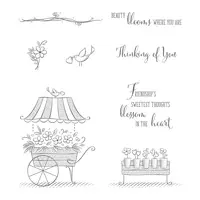
Friendships Sweetest Thoughts, 145826
My spring type flowers are my happy thoughts for warmer weather. I am tired of being cold! I definitely would not make it living in the north. So I went with spring flowers and soft colors.
The Night of Navy is a far cry from a “soft” color, that I was going for with this card. I think it works though. I believe it helps to draw out the color in the softer shades. I hope you like it as well. This was a super quick card to make and I hope you will give it a try.
Thank you so much for visiting my blog today. I very much appreciate it and I love your comments. The supplies I used are listed at the bottom of the page. Please contact me if you have any questions.
Have you ever thought about becoming a Stampin’ Up! Demonstrator? During Sale-A-Bration is the perfect time to join. Not only are you getting the Ultimate Bundle ($125.00 worth of product for $99.00) but you also get to choose 2 additional stamp sets, up to $25.00 each. Additionally you will get a 20% discount on any future purchases. Or, if you are just wanting to test drive the idea, you would not need to make another purchase until July! There is no pressure for you to continue as a demonstrator. And there is no penalty if you decide not to continue. Please contact me and let’s talk about it.
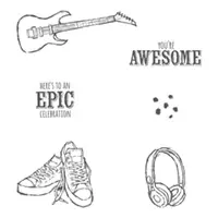
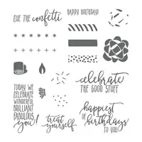
The sentiment on today’s stamp set is what first caught my eye when I was exploring the Sale-A-Bration Catalog. You’re Awesome!! It is from the set “Epic Celebration”. Who wouldn’t love to receive a card with that sentiment as the focal point? It was just too perfect to pass up.
You’re Awesome, 147236
This card uses almost the entire stamp set. I love creating with one stamp set and showing the versatility. This one would be great for a kid, or musician. The background is the new Scattered Sequins Dynamic Embossing Folder. But instead of having the dimension raised up, I turned it over so that it is an impression.
The background splatter is the flicking of the SU Marker created by my friend Julie DiMatteo. The black border around the sentiment is my method of using the SU Marker to go around the edge. This gives some depth without having to hand cut a matching layer for underneath. HaHa….Juie and I are both getting rich over these ideas 🙂
This unique shaped punch I used is from the masculine suite of products named True Gentleman. You will definitely want all of these items. They are wonderful and great for all cards. The punch is named Tailored Tag Punch.
Thank you so much for visiting today! The supplies I used are listed at the bottom of the post.
During Sale-A-Bration is the best time of year to join as a Stampin’ Up! Demonstrator. There are so many perks to this. We call it THE ULTIMATE BUNDLE !! Please contact me and let’s discuss all of the possibilities.
Sometimes making a regular card is very difficult for me. More the idea than the execution! LOL!!! But today I have gone a step further and made what I call a Double Card. It is simple and easy, just takes a minute to get the placement correct. Please let me know what you think.
Southern Serenade, 145921
If you can tell from the photograph, there is an oval cut in the front layers so that you see the flower on the inside of the card. When you open the front flap, you see just the flower, and then it opens again to show the sentiment and where you sign. That is why it is called a Double Card. The next two photos show this probably better than I explained it.
So after all of that, I think it is really an unusual card and a nice way to showcase a larger stamp. The most difficult part of this card is lining up the layers so that the ovals are properly lined up. I found that securing the top and middle layer together with temporary adhesive and then cutting is the best. I cut the size of the black layer first. Then cut the larger oval in just the white layer. The die leaves a small indented frame around the opening and this is very helpful in lining up your larger oval. I then repeated the process with the black layer and the base layer by temporarily adhering them and cutting the same size oval from the base layer. Theoretically all will now line up properly….. Hopefully!!
The background stamp is Sahara Sand and is stamped off first. The flower is stamped in Memento Tuxedo Black and then colored with markers.
Thank you so much for visiting today! I hope you liked this little bit different card. The supplies I used are listed at the bottom of the post.
MEASUREMENTS:
Base card in Sahara Sand is 8 1/2 X 5 1/2 folded in half
Welcome to InKing Royalty’s December Blog Hop! We have a fun Blog Hop theme today – Wrap it Up! The hop is filled with projects that are perfect for this time of year – everything from gift-packaging ideas to bundling up to stay warm. We are excited to share our creations with you today. After you read my post, I hope you’ll hop over to the next person on the list at the base of this post.
Thank you for joining me in this blog hop! My wrap it up project is the 3-D gift I made as a gift. This is my first post on a 3-D project. I feel like I was channeling my inner Julie DiMatteo when I made it. HaHa!!!!! Julie is the 3-D Queen, and a great friend. Although this project is from another SU Demonstrator’s YouTube video, www.positivelypapercraft.co.uk Here is a link to her video. Click Here
Here are a couple of pictures of the finished product.
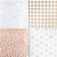
Year of Cheer DSP, 144640
I used the same DSP as the demonstrator did in her video. It was just perfect for what I needed. Any of SU’s thicker DSP would be wonderful. I changed the inner part to just Thick Whisper White card stock. I have already made a few in different colors as gifts. They really are easy to make. I cannot wait to give them out.
I have also made templates for the top and the bottom. I have not braved making a video tutorial yet, but this is one I would love to do. I found a few tricks that worked for me. I also used the 1 3/8″ circle punch instead of the Layering Circles Framelits that the other lady used.
Here are the templates I made. Hopefully they will make sense. If not, please do not hesitate to contact me with any questions.
Thank you for stopping by today. I hope you’ll hop along to the next stop on the blog hop, Shawn de Oliveira at Shawn Stamps.There’s lots of inspiration to be found in this group – and you don’t want to miss it!
Jackie
Thank you for hopping along with us. If you get stuck during the Blog Hop, please use this line-up as a guide:
My card for today is a birthday card I made for a really nice person. Saturday was Brian King’s birthday. He is not only a friend, but the best Upline you could ask for. So I had to make a special card.
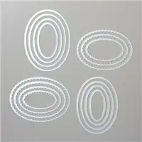
Picture Perfect Birthday, 145519
I wanted to make a card that was bright and shiny and a little bold. The only problem is that Brian hates, and that is putting it mildly, any kind of glitter. So I went with the beautiful Year of Cheer Specialty Designer Series Paper. This has to be one of my all time favorite of Stampin’ Up!’s DSP. It is shiny but not glittery, and is a heavier weight DSP. It is also only one sided as opposed to the normal two sided DSP.
With the paper being just perfect, I could not decide on what kind of stamp to choose. So I decided to go with the simple banner. The sentiment is from the upcoming 2018 Occasions Catalog and part of a great suite of products titled Picture Perfect Party. The stamp set is Picture Perfect Birthday. The inside sentiment , which is not pictured, is from the same set. It says “Happiest of Birthdays to you”, and is done in a really beautiful font. I love the way SU has added some mixtures of fonts on a single stamp lately. The banner font is different on the “you” which really emphasizes it.
And that is the card! To add a little bling instead of glitter, I added some rhinestones in appropriate places. Even guys can have rhinestones 🙂
Thank you so much for stopping by today! I hope you like my card and please do not hesitate to contact me if you have any questions regarding the products or anything.
The supplies I used are listed at the bottom of the page.
The content in this blog is the sole responsibility of Jackie Beers as an Independent Stampin' Up! Demonstrator. The use of and content of classes, services or products offered is not endorsed by Stampin' Up!