Today’s post is from a favorite set. I just love the sayings and have really used it quite often. And unfortunately it is on the retiring list. So many great sets are on the list …”insert really SAD FACE” !!
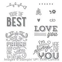
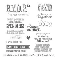
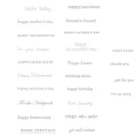
Friendly Wishes, Stampin’ Up!, 139579, $19.00
This is such a cute card . And who would not just love to receive it? It would definitely put a SMILE on your face. It also puts a smile on your face as the maker of this sweet card, because it is a quick and easy one.
The base layer is Melon Mambo 8 1/2 X 5 1/2, and folded in half
The white layer is 5 1/4 X 4
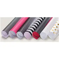
The Pop of Pink DSP is 5 1/8 X 3 7/8
The banner pieces are both just a smudge over 2 ” wide, to accommodate the stamp and 5″ tall ***
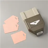
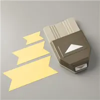
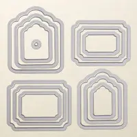
***I used the Scallop Tag Topper Punch and the Banner Triple Punch on both pieces. These both cut down on the finished size of the banners.
The banners are taped together and raised with our GOTTA HAVE THEM Dimensions.
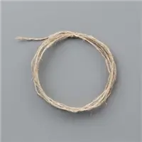
The ribbon is the Thick Baker’s Twine in Melon Mambo.
There you go, such a quick and cute card. And as I am trying to make myself use up all of my DSP (like I could possible use it all – HAHA!!), it is really quick to make.
Please remember that Retiring Items are mostly “While Supply Lasts”, so if you are thinking of a few items consider ordering them now. You can click on the Retiring Banner to go directly to the retiring list in my online store. You can also click on the card, or the SHOP button at the top of my page.
Thank you for stopping by today. I appreciate your visiting and I love your comments.
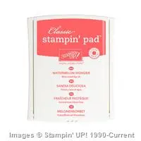
Welcome to InKing Royalty’s April Blog Hop! Today’s hop is filled with projects inspired by the Stampin’ Up!’s retiring 2015-2017 In Color Collection – our tributes to Cucumber Crush, Delightful Dijon, Mint Macaron, Tip Top Taupe and Watermelon Wonder. What fun! We’ve really enjoyed playing with these amazing colors over the past two years – and we are excited to share our creations with you today. After you read my post, I hope you’ll hop over to the next person on the list at the base of this post.
Isn’t it odd how we discover things and then they are discontinued? That’s the way I have been with the two colors I am focusing on today. Tip Top Taupe and Mint Macaron were “OK”, until about six months ago. Then they became some of my GoTo colors. Mint Macaron became a special favorite and I have used it probably too much.
For today’s card everything is retiring with the exception of two items. Check it out…….
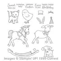
Little Cuties, 142990, $17.00
I used this card fold a few weeks ago. You can see that card by CLICK HERE. I just love how it shows off your stamped background or DSP. By separating the two pieces it gets an extra punch of attention. You can see that card from my Gallery at the top of the page.
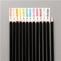
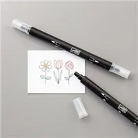
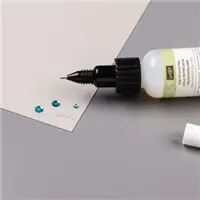
My base layer is Tip Top Taupe with Mint Macaron as the second layer. Moroccan DSP is the focal point along with the cutest little puppy from the Little Cuties set. I colored the puppy’s spots with Watercolor Pencils and spread it with a Blender Pen. The balloon is from Balloon Adventures and is punched with the Balloon Builders punch. The linen threat is held in the puppy’s mouth with just a dab of Fine Tip Glue Pen. I used a glue dot to hold the other end of the string underneath the balloon and to attach the bow to the balloon.
The dimensions for this card are:
Base card is 4 1/4 X 11, scored at 1 1/4 and 5 1/2 (Fold back or cut off the 1 1/4 piece)
Second layer is 3 7/8 X 4 1/8 and 1 3/8 X 4 1/8 for the side piece
Top layer of DSP is 3 3/4 X 4 and 1 1/4 X 4.
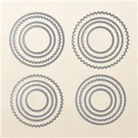
The Puppy was cut with the Layering Circles Framelits.
My supply list is at the bottom of the post. As I said in the beginning, almost everything I used will retire the end of May and some beforehand if they sell out. I would hate for you to miss out on something you are interested in. By clicking on the card or the supplies you will be taken to my on line store.
I hope you enjoyed this card and I would love to hear your comments.
Thank you for stopping by today. I hope you’ll hop along to the next stop on the blog hop, Lory Robinson at The Robins Nest Designs.
I find myself giving Gift Cards a lot more than buying actual gifts. I am at the age, not saying what age !, that if I want something I go buy it. And most of my friends are the same. So I find it better to give a gift card for a favorite store or restaurant than to worry over what they might like and not already have. Are you in that same area?
This card holds a gift card and is large enough for you to still write on and it fits in a standard envelope. Yay, and yay! Here is is:
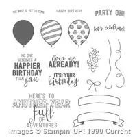
BYOP, & Balloon Adventures
BYOP & Balloon Adventures
As you can see in the first picture, the “Open Me Already” holds the card closed if you were giving the gift in person. You would not need to place it in an envelope.
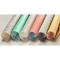
I apologize for the SAB DSP I used. I designed this card for a girl’s weekend shoe box swap and at the time it was during SAB. Then, of course, I forgot to use it in a post before it retired. However I am giving you all of the measurements so you can use any DSP you have on hand.
The measurements are:
Base is 5 1/2 X 8 1/2 and is scored at 2 & 5 3/4
Card slot is 2 X 4 1/4 and is scored at 1/4 on 2 short sides & 1 long side
Inside greeting is 4 3/4 X 3 1/4
DSP – small is 5 X 1 3/4 and larger is 5 X 2 1/2
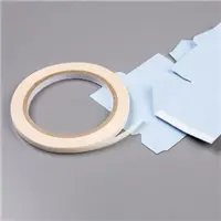
For the gift card slot , cut out the 2 corners where the scoring intersects. This makes for a less bulky fold. Score all the lines and add glue or tear tape to the three folds. I recommend folding the sides in first and then the bottom . This way your card, or cash, has a little more room in the bottom without getting hung on that flap. And it will hold cash as well as a gift card !
For the front closure be sure and place your dimensionals no higher than the center of the label and place them beside each other in the center. That way there is room for the top flap to fold under and by them being beside each other I think it gives it a little more strength. You don’t want your card to not work properly !!
Please if you have any questions about this card and my directions leave a comment or email me. I am happy to explain further.
Thank you for stopping by. The supplies I used are listed below. And Do Not Forget the Retiring List !!
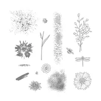
I am so very happy that Touches of Texture carried over to the new Annual Catalog. And with losing Gorgeous Grunge we definetely need the splatter and other background pieces.
My card today is a very simple background. I made this card for a swap at OnStage and did 14 backgrounds in about10 minutes. I put drops of reinker onto a clear block and then used the aqua painter to spread it on the Shimmery White card stock. The Shimmery White is perfect for this. Don’t get me wrong, I love watercolor paper but I find it hard to get a clear stamped image sometimes. With the Shimmery White, you easily get a clear stamped image and the added bonus of the “Shimmer”.
Her is my card:
Touches of Texture, 143251, $33.00
I hope you like this as much as I do. This is such a simple technique. It would be easy for beginner stampers and can be stepped up if more pizzaz is wanted.The unevenness of the watercolor makes it unique even if you are doing 14 like I did. No two look alike and that is great. I added two different sizes of the basic pearls to the open flowers for some added texture.
The layers are basic layers of base = 8 1/2 X 5 1/2, next layer = 4 X 5 1/4, watercolor = 3 3/4 X 5. So easy !!
Thank you for visiting with me today! Remember that the retiring list is out and is only while supplies last. So make your list of “Must Haves”, stock up on your favorite DSP, and just press the SHOP button at the top of my page.
Welcome to the Families First Pals Blog Hop for April 2017. We are thankful you stopped by to take a look at our 2017 Blog Hop monthly themes. This month we are featuring projects that are all about our families. This is a great time of year to think about what to make for Mother’s Day, Father’s Day, or upcoming graduations. And, family vacations are just around the corner… how would you want to remember those special family moments? We hope to provide you with lots of ideas and that you enjoy our creations.
You may just be starting the Blog Hop or may have come from the previous link from the Line-up on the Pals Blog Hop listing shown below. The full lineup will help you move along from blog to blog so you may see all the projects.
Thank You for stopping by my blog today. This is an AWESOME blog hop and I am thrilled to be a part of it.
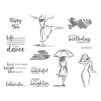
My card is Happy Mother’s Day with the Beautiful You stamp set. I fell in love with this set the first time I opened the Occasions Catalog. The free spirit this lady shows reminds me so much of my Mother, and the saying is perfect for her! So of course, I had to make a card representing that. Mine is not your typical Mother’s Day card. By changing or just removing the “Mother’s Day” at the bottom, it would work for many occasions. And here it is:
Beautiful You, 143657, $28.00
I just adore the Floral Boutique DSP and will truly miss it when this current annual catalog ends. I began this card with the Thick Whisper White card stock. I layered the DSP and then decided it needed a base so I added a narrow layer of Night of Navy card stock. The lady is stamped on Whisper White card stock and I used a sponge dauber to shade around her with Night of Navy ink. This layer also received a narrow border of Night of Navy. When I first started layering the card I had the lady layer on straight. But then I thought “This is a free spirit lady, she wouldn’t be a normal layer”, HaHa!!! So I layered her at an angle. The sentiment is stamped on Thick Whisper White card stock and punched with the 1 3/4 circle punch. The Happy Mother’s Day banner at the bottom of the card is from Teeny Tiny Wishes stamp set. I hope that set never goes away!! It has everything in it. I punched it out with the Classic Label punch and just cut the left side straight to match up the edge.
I hope you enjoyed my card and will continue on in the Blog Hop! Thank you for stopping by. If you like my card, I would love to hear from you.
My supply list is below the blog hop list. you can choose any item and it will take you directly to my online store.
Thanks for visiting. To continue with the hop, please refer to the Blog Hop Line-up below. We hope to see you on next month’s Pals Blog Hop!
We learned this wonderful watercolor pencil technique at our last InKing Royalty Team meeting from Jennifer Spiller. She is such a talented artist! She showed us how to use our framelits in a totally unexpected way. We traced around, or inside, the framelit of your choice with a watercolor pencil. Next you color inside, and this can be light, dark , or in between. Then take an aqua painter and spread the color around. It is so much fun to play with this technique. I hope you will give it a try once you see my card.
The card is so fun to make and is actually pretty quick to make as well. Here it is:
Watercolor Touches of Texture
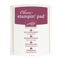
I chose the layering squares framelits and used the Rich Razzleberry watercolor pencil. You can use either Watercolor paper or Shimmery White card stock for this technique. On this card I did use watercolor paper. I traced around the framelit and then went around it again a littler darker. Next I just took the aqua painter and went to town. To me at least, you should “go outside the lines” ! It gives it a definite watercolor look. I have found that I need to occasionally wipe off the aqua painter because I tend to get too much water. This is just something you have to play with to find your own method!!
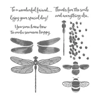
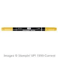
Once the square was dry, I stamped the flower from Touches of Texture in Memento Black ink and then the solid of the flower and the splatter are also Rich Razzleberry ink. I did go back with my Daffodil Delight Stampin’ Write Marker and color in the center of the flower. I stamped the sentiment from the Dragonfly Dreams stamp set.
I did not feel that this card needed any additional layers. So I just mounted it onto a Rich Razzleberry base card.
I hope this card has given you a SMILE today! Thank you for visiting my blog and I do love to hear from you in the comments.
The content in this blog is the sole responsibility of Jackie Beers as an Independent Stampin' Up! Demonstrator. The use of and content of classes, services or products offered is not endorsed by Stampin' Up!