This month, we have a Tic Tac Toe theme. We really hope that you will be inspired by all the amazing creations the Pals are sharing with you! As you hop from blog to blog, we love reading your comments. Then, you will find the lineup at the end of my post to help you “hop” along from Pal to Pal.
I decided to go right down the center of the Tic Tac Toe box. It makes a fairly quick and simple card with some unexpected twists. Stamping on DSP is a fun change of pace.
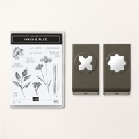
Stamp Bundle
One of Suites that intrigued me immediately is the Inked Botanicals on page 96. The Bundle is the Inked & Tiled Bundle. It is a Punch bundle, which are my favorite! And this one has two punches in the bundle. For some unknown reason I have always loved the distressed stamps. Maybe because they look imperfect and make it a good thing!!
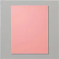
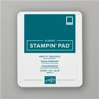
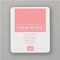
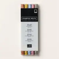
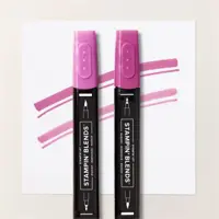
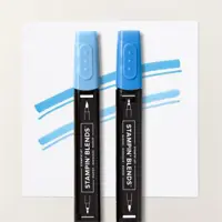
The flowers are colored with Stampin’ Write Markers direct to rubber. I used Flirty Flamingo and Pretty Peacock Markers. And then stamped onto the DSP piece. The extra flower is in the same set and was stamped on scrap paper after being inked with Flirty Flamingo Ink. The sentiment was stamped on scrap as well using Pretty Peacock Ink. The punch used is the cross looking punch. I centered the sentiment on one of the cross bars and punched. Then using paper snips I just cut away the other cross bar. Easy Peasy!!
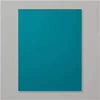
Papers
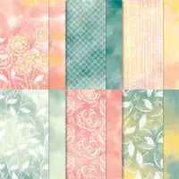
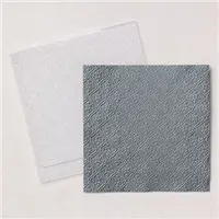
The Designer Series Paper in the Suite is gorgeous. But…it was too dark to stamp on. And the idea to stamp on the DSP was in my brain. So I turned to the Hello Irresistible Designer Series Paper. I used two different sheets of the paper. They are a similar print, just one is Soft Sea Foam and the other Pretty Peacock tones. The stamped image shows well on the lighter piece of DSP.
My layers were pulled from the stamped flowers. The Flirty Flamingo to separate the two darker colors and then Pretty Peacock as the card base. I really love the two of these together. It was a surprise actually!
Finishes
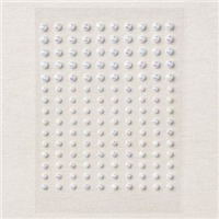
The finishes for the card expanded as I was building it. The ribbon is from the Ribbon Duo Combo Pack. It is included in the Zoo Crew Suite of products. I have already mentioned the extra flower, which I fussy cut with my paper snips. And the sentiment created from the cross bar punch. The final touches were the scattering of Iridescent Pearls.
More inspiration awaits, so use the lineup below to visit the rest of the Design Team. The Pals are very excited to show you what they’ve created! Then, please mark your calendars for our next blog hop on June 14th, when our theme will be showcasing the New 2023-2025 In Colors.
Online exclusives are here to stay! Click on the photo and be taken directly to them in my online store. If you place an order, please use my Host Code listed just below.
HOST CODE
My May Host Code is K326G6VQ. Please use this code for orders under $150.00. I will have a small gift for those with orders over $50.00 in addition to the Perk Rewards Program. You can read all of the information at the top of the page in the Menu Bar under SHOP / Perks.
Thank you for stopping by today. I hope you enjoyed today’s project and will come back. I do read and reply to all of the comments individually. They mean a lot to me. Please reach out if you have a question.
I have been playing with all of the Stampin’ Up! Designer Series Paper the last few days for my Paper Share. They are all gorgeous, as always. But I have to say that my favorite for now is the Online Exclusive Hello Irresistible. The paper is so pretty and could be framed just as it is.
Papers
I said this paper could be framed and that is pretty much what I did for today’s card. The colors on this piece of Hello Irresistible Designer Series paper are so pretty. And I love the variegated shading of the mix of colors. And this mix led me to two unusual colors for the “frame” of this piece.
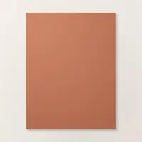
The two colors of card stock I chose are not listed on the paper pack. These two pieces were on my desk after cutting for a class. And it surprised me how well they look together. Then adding the DSP piece was very surprising. And in a good way! Flirty Flamingo is a brighter color obviously, but I believe the Copper Clay brings out the darker tones in the DSP. And the Wild Wheat really matches the goldish shade in the DSP. I call it a Win. Please let me know what you think.
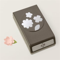
Stamps and Punches
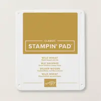
The paper is the star of the show here, but I did add a small sentiment and in a fun way. The sentiment is from the Sentimental Park stamp set. I wanted just a small and simple sentiment to not detract from the paper. This “Love” stamped in the Wild Wheat ink was perfect.
To add a little something extra, I looked for a fun punch to use for the sentiment. I finally came across the Petal Park Punch. The larger flower fit the word, and also the flowers on the card. All I had to add was just a bit of curl to the petals on the flower.
Finishes
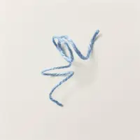
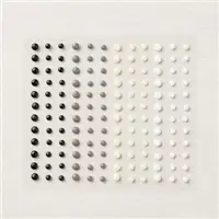
I added the 2023-2025 In Color Jute Twine in Copper Clay in place of a ribbon. I like the idea of twine with flowers. They seem to go together. And this Jute, even though thicker than I expected, was very easy to work with. It was also a perfect grounding spot for the flower sentiment.
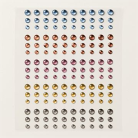
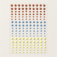
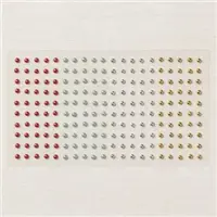
To complete the card there must be bling. I used the new 2023-2025 In Color Dots. The Copper Clay small one is on the sentiment flower. And two of the Wild Wheat smaller ones are added to the two largest flowers in the paper.
Thank you for stopping in today!!
Online exclusives are here to stay! Click on the photo and be taken directly to them in my online store. If you place an order, please use my Host Code listed just below.
HOST CODE
My May Host Code is K326G6VQ. Please use this code for orders under $150.00. I will have a small gift for those with orders over $50.00 in addition to the Perk Rewards Program. You can read all of the information at the top of the page in the Menu Bar under SHOP / Perks.
Thank you for stopping by today. I hope you enjoyed today’s project and will come back. I do read and reply to all of the comments individually. They mean a lot to me. Please reach out if you have a question.
The “Smile” card I am sharing today is a technique that is difficult for me. It is a One Layer card. Since I tend to have multiple layers, only having one in addition to the base is very difficult for my brain. LOL!!
Today’s card was designed for the Make My Monday Blog Challenge. As a designer we get to choose a few of the challenges each year. This idea was mine, silly me. LOL!! Hopefully you will join the challenge and add your own version of the one layer card. Simply click on the icon below and you will be taken to the blog. Add your own creation at the bottom of the page.
Stamps
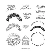
These images are all from the Circle Sayings Stamp set. I have used this set recently and still love it! The fact it is a punch bundle put it to the top of my Must Have List. Although I did not use the matching punch on this card. The cupcake, flowers, and sentiment are all from the stamp set. I love simple sentiments like the Smile. And it was a perfect and simple one for my one layer.
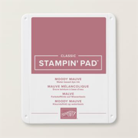
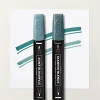
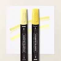
The cupcake is stamped on the card base actually. It was stamped through the hole for perfect placement. I have used several of the new / returning colors. The cupcake cup is colored with Pretty Peacock Stampin’ Blends and the icing is Lemon Lolly. For the flowers they are stamped with the new Moody Mauve with Pretty Peacock for the leaves.
Punch
To make this one layer card a little more interesting, I used the 1 3/4″ Circle Punch. This is one from the Online Exclusives. Punches are so quick and easy to use and I am thrilled that Stampin’ Up! has brought back some of the Circle Punches. To create the see through for the cupcake, I put the paper a little right of center into the punch. Next I placed it on the card base temporarily, and then stamped through the hole. That way when I added the Stampin’ Dimensionals I know the cupcake was positioned properly.
The circle needed a little decoration though. So I stamped the flower stamp across the top and then fussy cut a couple of extras to add to the bottom. That may be cheating just a tad on the One Layer. And to help the circle pop a little, I used the Moody Mauve Stampin’ Write Marker and went around the inside of the circle. I held the layer in one hand and with the other had the marker coming from underneath. By placing the center of the length of the brush tip against the cut out, it left just a darker line around the hole. This method is great for just a touch of detail. And from the photo you may not even notice. It does show better in person.
Finishes
The final touches for this card were very simple ones. I stamped the Smile with Memento Tuxedo Black Ink. And I added one of the Adhesive Back Solid Gems in Lemon Lolly next to the sentiment. That is minimal bling for me!
Thank you for stopping in today!!
Online exclusives are here to stay! Click on the photo and be taken directly to them in my online store. If you place an order, please use my Host Code listed just below.
HOST CODE
My May Host Code is K326G6VQ. Please use this code for orders under $150.00. I will have a small gift for those with orders over $50.00 in addition to the Perk Rewards Program. You can read all of the information at the top of the page in the Menu Bar under SHOP / Perks.
Thank you for stopping by today. I hope you enjoyed today’s project and will come back. I do read and reply to all of the comments individually. They mean a lot to me. Please reach out if you have a question.
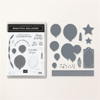
The Beautiful Balloons Bundle is a fun one for a multitude of reasons and uses. Plus the Bright & Beautiful DSP is exactly what the name says!
Stamp Bundle
I have used both the stamps and the dies for today’s card. As I said in the beginning it has a lot to offer. There are cute and versatile sentiments to go with fun images. And the Dies are just as wonderful. I have showcased two from the dies with the tag and the star. The sentiment is from the stamp set. This card would work for a variety of reasons. Since Graduation is fast approaching, I believe it would be a cute Graduation card.
Papers
To go along with the Beautiful Balloons Bundle, I used the matching DSP. It is the Bright & Beautiful Designer Series Paper. This is one of the 6×6 packs, which I love. Both of the pieces I used are from the pack. There are fun and “Party” type sheets, as well as some more generic ones. But they all coordinate.
To pull the colors from the paper for the card base was so easy. I went with the boldness of Berry Burst. This returning color is a wonderful one. And I paired it with the softer, but totally new, Lemon Lolly. This is a bright but light yellow. I think the two work great together to separate and highlight the DSP pieces.
Finishes
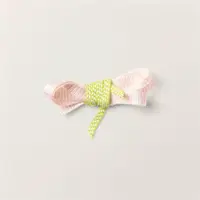
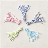
For finishing the tag I turned to the 2022-2024 In Color Baker’s Twine. I am so happy this carried over. Baker’s Twine is such a great accent and so easy to work with. I doubled the twine and made the Vera Bradley pull. It stays in place much better than the old bookmark loop.
As the final touch I added some of the Adhesive Solid Gems. That is such a plain name for some adorable colored gems. They are in Lemon Lolly, Boho Blue, and my guess is Copper Clay. But I love the look of them. So I scattered some around on the blue DSP and the tag.
Thank you for visiting today! Happy Cinco De Mayo and I hope you have a great weekend.
Online exclusives are here to stay! Click on the photo and be taken directly to them in my online store. If you place an order, please use my Host Code listed just below.
HOST CODE
My May Host Code is K326G6VQ. Please use this code for orders under $150.00. I will have a small gift for those with orders over $50.00 in addition to the Perk Rewards Program. You can read all of the information at the top of the page in the Menu Bar under SHOP / Perks.
Thank you for stopping by today. I hope you enjoyed today’s project and will come back. I do read and reply to all of the comments individually. They mean a lot to me. Please reach out if you have a question.
Today I am showcasing another of the new stamp sets in the Annual Catalog. I hope you were able to get your first order in yesterday. The waiting on arrival is the hard part for me. Wanting to see things in person and play with them has so many of us very excited. Hopefully this little peek will help you with that.
Stamp Bundle
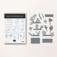
This Timeless Arrangements Bundle is a wonderful bundle! The floral images are great and the dies are even better. The images were stamped in Pretty Peacock for the greenery and colored with Pretty Peacock Stampin’ Blends. Garden Green was used for the berry stems with the berries colored using Berry Burst Stampin’ Blends.
The fun sentiment is also from the stamp set. And the Die is so cute! It is a perfect size for so many sentiments. There are tiny “x”s center top, bottom, right, and left. They remind me of little cross-stitch x’s.
Paper
The paper for this card is pretty simple. It is White on White. But that is a good thing. It shows the versatility and beauty of the stamps. To add some detail, although it did not show in the photo, I did some scoring on the stamped panel. I scored at 1/2″ all the way around. And then I scored each 1/4″ from the top score line to the bottom score line between 1 1/2 and 2 1/2 marks. In person it looks really nice and a bit on the elegant side. Just remember to stamp before you score!
Finishes
This card is a really quick and easy one, even with the scoring and die cut sentiment. I used Stampin’ Dimensionals to raise the sentiment. But it still needed “something”. To match the colors used I turned to the wonderful, and thankfully carrying over, Festive Pearls. A trio of them are scattered around the card.
Thank you for stopping in today!!
Online exclusives are here to stay! Click on the photo and be taken directly to them in my online store. If you place an order, please use my Host Code listed just below.
HOST CODE
My May Host Code is K326G6VQ. Please use this code for orders under $150.00. I will have a small gift for those with orders over $50.00 in addition to the Perk Rewards Program. You can read all of the information at the top of the page in the Menu Bar under SHOP / Perks.
Thank you for stopping by today. I hope you enjoyed today’s project and will come back. I do read and reply to all of the comments individually. They mean a lot to me. Please reach out if you have a question.
I hope you are as excited as I am for the new Annual Catalog to be LIVE!!!!! My wallet is not quite as happy, but my heart is. Waiting on the new items is the hardest part. So I have a few new products to share with you in today’s card.
Stamps
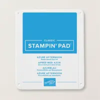
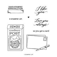
If you have been following me for very long, you know that I love the whimsical and just different stamp sets. This stamp set is not really different, but it spoke to me. And I am so happy it did. I believe this is the perfect image for a number of reasons. It is on page 117 of the new catalog. To make the post box a little brighter, I decided to add the touches of blue. The POST is stamped again on scrap with the Azure Afternoon Ink Pad. It is cut close to the letters and then overlayed over the black letters. I wanted it to stand out more and that was a simple way to do that. The pretty plaque on the box is colored with the Azure Afternoon Stampin’ Blends.
A simple Note is a great reason for a card. Especially when the sentiment is so elegantly scripted for the I Like You sentiment. To go along with that sweet front sentiment, the inside one is even better. Sadly I forgot to take a picture of it. But it is a very plain block letter that says “so you get a card” !! I love that! You get classy and simple all in one card.
Layers and Colors
The card base is Basic White to go along with the image layers. And the first thin Basic Black layer is to add to the pop of the black with the post box and the sentiment. The pretty layer is the Azure Afternoon card stock embossed using the Quatrefoil Tile Embossing Folder. In my mind it somewhat is similar to the plaque on the post box.
Dies
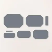
The fun shapes for the image and sentiment are from the Countryside Corners Dies. There are five dies like the image one and then two small for sentiments. They are a great size for most images and for layering. The sentiment piece is another example of a use of the die. It is the smaller of the 5 same shaped ones. I die cut it and then stamped in the upper end. Using the Paper Trimmer I then cut it just below the sentiment. By placing it in the bottom corner, it seems a perfect shape and fit. The final touch was a scattering of the Classic Matte Dots in black. The third one is sort of hiding. It is in the center of the blue plaque on the post box.
Thank you for stopping by today! Please let me know if you have any questions.
Online exclusives are here to stay! Click on the photo and be taken directly to them in my online store. If you place an order, please use my Host Code listed just below.
HOST CODE
My May Host Code is K326G6VQ. Please use this code for orders under $150.00. I will have a small gift for those with orders over $50.00 in addition to the Perk Rewards Program. You can read all of the information at the top of the page in the Menu Bar under SHOP / Perks.
Thank you for stopping by today. I hope you enjoyed today’s project and will come back. I do read and reply to all of the comments individually. They mean a lot to me. Please reach out if you have a question.
The content in this blog is the sole responsibility of Jackie Beers as an Independent Stampin' Up! Demonstrator. The use of and content of classes, services or products offered is not endorsed by Stampin' Up!