This month, the theme is a Color Challenge. Using Crumb Cake, Mango Melody, Cajun Craze and Mossy Meadow, the Design Team has created some great projects that you will all want to see. We hope that you will be inspired by all the amazing creations! As you hop from blog to blog, we would love for you to leave a comment. Then, you will find the lineup at the end of my post to help you “hop” along from Pal to Pal.
Card challenges are a perfect way to get inspiration. And a color challenge is great and just means finding a stamp set that works.. Or to compare the colors to see which Designer Series Paper might have the colors. This is a challenge I enjoy. Then I went very simple in the end! LOL!!
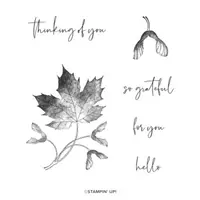
My card is a case of one I saw on Pinterest. My focal point is the leaf as well as the frame it is stamped inside of an on top of.
Layout
My frame was made using the Stylish Shapes Dies. The largest of the squares was used. After cutting the shape, I layered the same size paper underneath and then stamped. After debating on using dimensionals between the two layers when finishing, I chose not to. Now seeing the photograph, it might have shown up better with more depth. But you can see the stitching around the edges and where the leaf is stamped on the top layer at the bottom, right, and top of the image.
Stamping
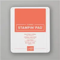
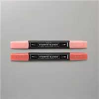
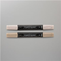
The leaf used is from the Soft Seedling stamp set. It was inked all over with Calypso Coral Ink pad and then with Stampin’ Write Markers I added Cajun Craze, Mossy Meadow, and Mango Melody. After stamping, I went back and made a few touches with the various markers to smooth things out. Note: Our Stampin’ Write Markers are only available in a color family, with the exception of Basic Black. So these are not listed in my supply list as they each are from a different color family.
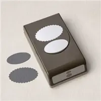
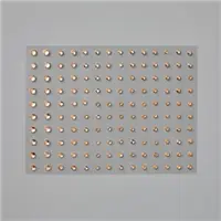
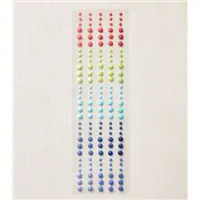
The sentiment is from the Ringed With Nature stamp set. This card really needed a small sentiment, or a vertical one. Instead I opted for this one and my favorite Double Oval Punch. So to finish off, I added the Champagne Rhinestones in three different sizes.
More inspiration awaits, so use the lineup below to visit the rest of the Design Team. The Pals are excited to show you what they’ve created! Then, please mark your calendars for our next blog hop on November 9th when the theme will be Home for the Holidays.
My October Host Code is R26UJTTW. Please use this code for orders under $150.00. I will have a small gift for those with orders over $50.00 in addition to the Perk Rewards Program. You can read all of the information at the top of the page in the Menu Bar under SHOP / Perks.
Thank you for stopping by today. I hope you enjoyed today’s project and will come back. I do read and reply to all of the comments individually. They mean a lot to me. Please reach out if you have a question.
Some of the cutest stamp sets in the catalogs are sometimes in the Host Rewards section. And due to that they are often overlooked. Today I am sharing one of those for a quick card.
Stamp Set
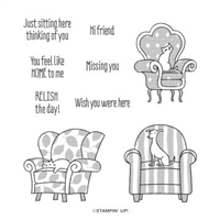
This card is a one stamp set card using the Sit Stay Relax stamp set from Host Rewards in the Annual Catalog. Since I have cats, it was a must have for me. There is a dog sitting in a chair as well. Sitting and reading is my great passion next to stamping. So between that and the love of cats, this card was born. And the fact it is a one stamp set card is always a plus!
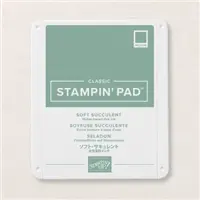
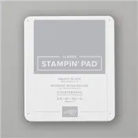
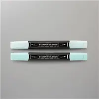
The chair and the cat in it was stamped using Soft Succulent. Of course that would not work for a cat color. So I used my Basic Black Stampin’ Write Marker and went over the cat outline. He is then colored using a Smoky Slate Stampin’ Blend. After seeing how well Smoky Slate pairs with the Soft Succulent, I used that for the sentiment as well.
Here is one of my cats doing the Sit , Stay, and Relax thing!
Papers
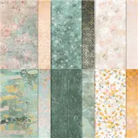
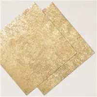
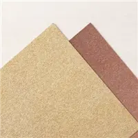
When looking for a complimentary DSP to the Soft Succulent, I found this piece of the Texture Chic Designer Series paper. I love the different shades of color plus the pop of gold. To add a little more of the gold, I added the strip of the Distressed Gold Specialty Paper. This is by far my favorite gold ever! The different look is wonderful and it is not overly shiny.
Finishes
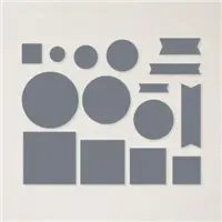
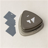
To finish the card I decided the focal layer needed some fancying to go along with the beautiful DSP. With the help of the Very Best Trio Punch that was achieved. Note: You need to practice with the punch to see how to get the same image each time. It can go in two different directions.
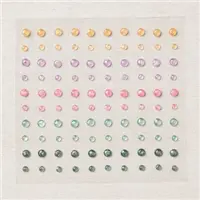
The final touch was to give that large piece of White some bling. That was accomplished with the 2021-2023 Opal Rounds embellishments. These compliment the gold in the papers and sort of ground the focal layer.
HOST CODE
My October Host Code is R26UJTTW. Please use this code for orders under $150.00. I will have a small gift for those with orders over $50.00 in addition to the Perk Rewards Program. You can read all of the information at the top of the page in the Menu Bar under SHOP / Perks.
Thank you for stopping by today. I hope you enjoyed today’s project and will come back. I do read and reply to all of the comments individually. They mean a lot to me. Please reach out if you have a question.
Birthdays are my favorite cards to make as they are generally for a friend. Card making is about sharing our love of crafting with friends and family. Today’s card is a multiple layer floral version.
This card uses a group of different dies, stamps, and papers for a birthday challenge. It is for the Make My Monday Challenge. My fellow designers and I hope to give you ideas and inspiration for your own versions. You can check the other cards and also add your own by clicking on the badge below.
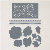
Stamps and Dies
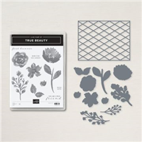
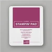
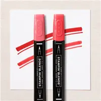
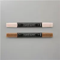
These pretty flowers and leaves are from the True Beauty stamp set. The flowers were die cut using the matching Organic Beauty Dies. All of the flowers were inked and stamped using Rich Razzleberry Ink. One of the two together was the “stamped off” version. The softer color works well. And the leaves and stems are all done with Mossy Meadow Ink. For the bundle of buds, I used the Rich Razzleberry and Mossy Meadow Stampin’ Write Markers.
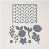
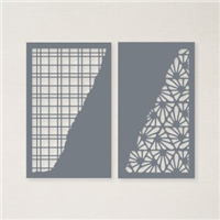
To add to my floral card, I used the Split Card Texture Dies for the lattice look on the left side of the card. This die gives such awesome detail. It comes with a second similar die. The Rose and Gold Specialty Designer Series Paper is a much thicker piece than most of Stampin’ Up!’s DSP. Even with running it through the Cut & Emboss machine three times, there were a few pieces that had to be punched out. So keep that in mind when using this die. However, it is well worth the extra effort !!!
Papers
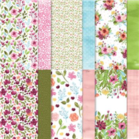
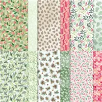
The pretty floral paper behind the lattice die cut is from the Awash In Beauty Designer Series paper pack. So the other colors were chosen from that piece. Rich Razzleberry is the card base as well as the flower colors. There is Balmy Blue as the layer. It was supposed to be shown again around the sentiment, but I ended up in a different direction there. Can you relate?
Finishes
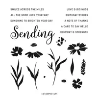
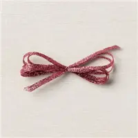
After adhering all of the layers and the flowers, I had to decide where and how to add the sentiment. To make the sentiment pop, I know it seems odd, but I went back to Basic White! With all of the colors, the white actually showed better than anything. This is where the blue got pushed to the side and the Sweet Sorbet Metallic Ribbon for a double loop bow was used instead. A simple flagging of each end of the sentiment was all it needed. (The sentiment is from the Sending Smiles stamp set) And the final touches were a scattering of Rhinestones around the flowers.
HOST CODE
My October Host Code is R26UJTTW. Please use this code for orders under $150.00. I will have a small gift for those with orders over $50.00 in addition to the Perk Rewards Program. You can read all of the information at the top of the page in the Menu Bar under SHOP / Perks.
Thank you for stopping by today. I hope you enjoyed today’s project and will come back. I do read and reply to all of the comments individually. They mean a lot to me. Please reach out if you have a question.
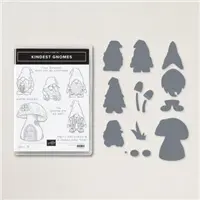
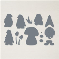
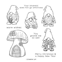
The Kindest Gnomes Bundle has grown on me since the Mini Catalog debuted. So today’s card is a CASE of the catalog to share how much fun these stamps are. Plus I just love to color!
Stamps and Dies
The Kindest Gnomes Bundle includes the stamp set and the Gnomes Dies. There are four images, the little house, and some sweet sentiments in the stamp set. The Die set includes some additional pieces for layering on the people for a 3D effect. My card is the more simple stamp, color, die cut. And I had so much fun coloring these images. As I mentioned at the top of the post, I cased page 43 of the Mini Catalog for this layout. My version is a little simpler though.
Additional Pieces
From doing the CASE of the catalog, I used the notebook look at the top of the Pear Pizzaz. This is from the Blossoming Happiness Dies. In the catalog they used the more regular round holed notebook look. My choice was the rectangle holes, but it is the same look. There needed to be something else besides my three images on the card. So I added a little brick walkway. It is probably not something you would see in the woods. But I loved how well it played against the Sweet Sorbet card and the red hair of the lady gnome.
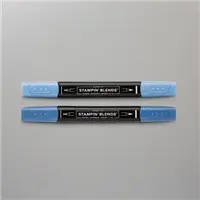
The sentiment is from the stamp set and was the exact one I was looking for to thank a dear friend. But trying to find a place for it was a little difficult. In the end I placed it as it is now and was happy. By cutting the edge to match the Pear Pizzaz edge it almost looks like another pathway. And it is finished off with a 2022-2024 Matte Dot to match the blues in the coloring.
Starter Kit
Now is definitely the time to join my team and Stampin’ Up!. This is a great chance for you to give it a try, see into the background on being a demonstrator, and get quite a lot of merchandise for a wonderful price! I would love to talk with you about this opportunity!
HOST CODE
My October Host Code is R26UJTTW. Please use this code for orders under $150.00. I will have a small gift for those with orders over $50.00 in addition to the Perk Rewards Program. You can read all of the information at the top of the page in the Menu Bar under SHOP / Perks.
Thank you for stopping by today. I hope you enjoyed today’s project and will come back. I do read and reply to all of the comments individually. They mean a lot to me. Please reach out if you have a question.
Before I get to the card I have for you today, I need to mention the wonderful new Starter Kit promotion. I failed to add it to my list of new the other day. In my opinion the Starter Kit is the Ultimate Bundle! Because there are no obligations to do anything beyond purchasing the kit, you are getting a great deal of products for an awesome price. In this promotion you get to choose $30.00 extra at no additional cost. So for your $99.00 purchase, you choose $155.00 in product of your choice. That is an awesome deal no matter how you look at it! So if you have been considering joining, or just want this deal, please reach out to me. I would love to help you join my team.
Today’s card
The card I have to share today is a different orientation to a previous layout. This type layout is a great way to use small pieces of your designer paper.
Layout
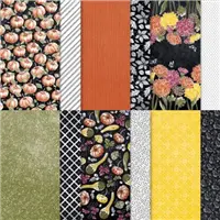
This peekaboo layout with the DSP is created using the Rustic Harvest Designer Series paper. And if it looks familiar, it is because I have made it previously in portrait mode. You can see that card HERE.The directions were explained in that previously post, but in this instance cut your layer of DSP 1″ less in width than you normally would. Then cut off 1″ from the end. Next cut a strip of a complimentary piece of DSP that is the same height as your other piece. And cut it to 1 1/4″ in width.
Place dimensionals on the larger section, but do not place them too close to the edge on the right side. Adhere that layer down. Apply adhesive to the different piece of DSP, and slide it just a bit under the edge of your raised layer and flush at top and bottom. Next add dimensionals down the center of the 1″ strip of DSP and adhere it to the layers flush on top, right, and bottom. It should slightly overlap the single DSP piece. And that is it, Easy Peasy!!
Embellishments
In addition to actual embellishments, I went with a variety of punches and stamps. The Crushed Curry layer is punched using the Handmade Tag Punch. It then gets some added dimension by the little curly stamp from the Hello Harvest stamp set. And the sentiment is punched using my favorite the Double Oval Punch. This sweet sentiment is from the Very Best Occasions stamp set. These layers are finished with a 2021-2023 Pearl. I love how the different edges layer together with the focal area.
HOST CODE
My October Host Code is R26UJTTW. Please use this code for orders under $150.00. I will have a small gift for those with orders over $50.00 in addition to the Perk Rewards Program. You can read all of the information at the top of the page in the Menu Bar under SHOP / Perks.
Thank you for stopping by today. I hope you enjoyed today’s project and will come back. I do read and reply to all of the comments individually. They mean a lot to me. Please reach out if you have a question.
Reminder that today is the day for FREE Shipping with qualifying orders. This is always a welcome event, and I am ordering supplies for my Christmas cards. It is time to get those cuties set up to make. And if you shop with me, you will earn 1 Blue Star Rewards for each $50.00 you spend. So a doubly good thing.
Today’s card is a Thank You that I made for a class. It is quick and easy with a little bit of gate fold to go with it.
Stamps
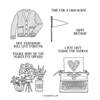
The Forever Friendship stamp set is a simple set that I love. It is a little bit on the “Pun” side, with fun images to go along with those sentiments. But this typewriter is my favorite. There is something about the simplicity, or maybe the old fashion idea, of a typed note. And the Thank You included in the image is perfect for me. It is a one stamp and done focal layer.
Background
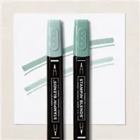
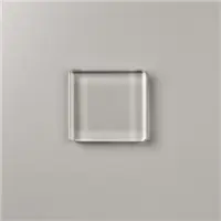
For a bit of a different look, I used the Clear Block D inked with Soft Sea Foam ink to create the background for the typewriter. Personally I like the mottled look that this gives. And the imperfections of the image are fine for me. If you prefer a more solid look, you can add more ink with a sponge or blending brush. By stamping the image in Black, it still pops from the light green.
Papers
The card base is Bermuda Bay with a layer of Soft Sea Foam. These colors were pulled from the DSP. It is the Pretty Prints Designer Series Paper. This print is a soft mix of a few colors and is a calm print. There are other colors mixed in if my choices do not suit you.
Fold
The fold used on this card is an offset gate fold card. It is one that I use occasionally and in both portrait or horizontal layout. This one is the Bermuda Bay cut to 5 1/2 X 8 1/2 and scored at 1 1/2 and 5 3/4. You could score them equally, but I like the different sizes for this horizontal look.
The Soft Sea Foam layers are cut to 5 1/4 X 2 1/2 and 5 1/4 X 1 1/4. And the DSP layers are cut to 5 X 2 1/4 and 5 x 1. The focal layers are square with the Bermuda Bay being 3 3/8 X 3 3/8 and White at 3 1/4 X 3 1/4.
HOST CODE
My October Host Code is R26UJTTW. Please use this code for orders under $150.00. I will have a small gift for those with orders over $50.00 in addition to the Perk Rewards Program. You can read all of the information at the top of the page in the Menu Bar under SHOP / Perks.
Thank you for stopping by today. I hope you enjoyed today’s project and will come back. I do read and reply to all of the comments individually. They mean a lot to me. Please reach out if you have a question.
The content in this blog is the sole responsibility of Jackie Beers as an Independent Stampin' Up! Demonstrator. The use of and content of classes, services or products offered is not endorsed by Stampin' Up!