I am still loving the Stone & Vines Embossing Folder. It pairs with so many stamp sets. Today’s card is a “lovely” one mixing the vines along with Sweet Blooms. I am loving the mix of colors for this one as well.
The Sweet Blooms Bundle
This great bundle is from the Annual Catalog. Since I was packed up for the move several months I have missed playing with quite a lot from the catalog. So I am going back through and finding wonderful products. This is one of them. The sentiment is stamped and fussy cut, then paired with the “lovely” die cut from the matching Die set. These are more spread out than I would normally arrange them. But I did not want to cover up the floral part any more than necessary. It took some playing around.
Florals In Bloom Designer Series Paper
The sentiments are stamped or die cut, and that is all of the stamping other than the inside of this card. The pretty floral arrangement is die cut or fussy cut from the DSP. I wish I could color the flower as beautiful as the pink one is. So I opted to let the professionals do it for me. LOL!!
Stone & Vines Embossing Folder
Once again I have turned to this wonderful new 3D embossing folder. And it is really 3D! Actually this one was embossed at the same time as the previous card using this folder. Having used the two tone Garden Green cardstock, I did one from each side to show the different colors. Although the center of that cardstock is white as you can see from the definition of the leaves. This is the darker of the two sides. You can see the previous card HERE.
Extras
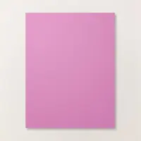
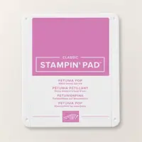
The card base is Petunia Pop to match the flower. I am thrilled with how well it pairs with the Garden Green. To further that pairing, I used the Garden Green Chevron Ribbon to wrap around the layer a couple of times. This was a perfect grounding for the flowers. The final Extra is the bling. This is once again the Sparkle Dot Essentials. I love these with their extra sparkle, the different colors, and sizes, plus they are flat. Many wins all in one with these embellishments.
STAMPIN’ REWARDS
You will earn rewards on all orders over $20.00 in products The system will track your rewards for you. And they will be available for use on your next order, or you can save up for a larger purchase. All you need to do is on your first order is agree to participate. You will then begin receiving rewards on qualifying orders.
Orders of $50.00 or more you will still receive an appreciation gift from me. I appreciate you choosing me as your demonstrator!
COMMENTS
Please know that I love to hear from you and answer any questions you may have. My responses generally are not done here on the post. They are made using my phone as I have found it is easier to answer a question for you personally. So you will be receiving an email from me if you make a comment.
Thank you for stopping by today. I hope you enjoyed today’s project and will come back. I do read and reply to all of the comments individually. They mean a lot to me. Please reach out if you have a question.
Smile and Keep On Stamping,
Jackie
Online Exclusives
New Online Exclusives drop every other month. These are amazing products and are a supplement to the Annual and Mini Catalogs. This way you have access to even more New and Awesome products!
You can go directly to these in my Online Store by clicking HERE
The Sweet Jar Bundle is one I have shared a couple of times already. Today it is featured as a Pop Up. I love Fun Folds and this one is also one I have shared previously. When they are easy and fun it is worth sharing again and with different images.
This paper is gorgeous, but here is the fun part!!
STAMPS
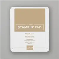
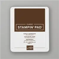
This jar of cookies is a great surprise gift for just about anyone. To begin with this fun image, It is from the Sweet Jar stamp set. The jar is stamped using the new Cloud Cover Ink. (customers cannot purchase the Cloud Cover Ink Pad due to a color issue between ink and the foam of the pad. You can purchase the ink refill and ink a Stampin’ Spot and the ink color is perfect) The cookies are stamped off Crumb Cake with Early Espresso as the chocolate chips. And the lid of the jar is Strawberry Slush. The inside sentiments are also stamped with Strawberry Slush and are from the Sweet Jar set.
The front circle sentiment is from the Encircled With Love stamp set. I do Love this set. It is all circle images with different sentiments for a variety of purposes. A quick circle punch and finished! For this use I stamped the image using Garden Green Ink that is pulled from the DSP. I wanted the front sentiment to pop.
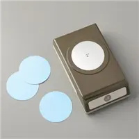
PUNCHES
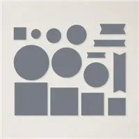
The circle shapes for the front image are both Circle Punches. However there are a variety of different circles in different Die sets you could use. For example the spotlight on Nature , and Stylish Shapes Dies. I used the 2″ and 1 3/4 ” Circle Punches. There is one in the Annual Catalog that is a match for these circles but it is not available yet. It is the 1 7/8″ Circle Punch. This one pairs with a different set, but also coordinates with the Encircled With Love also.
PAPERS
The bright colors of this DSP is fabulous to me! I love Brights. This sheet is from the Floral Impressions Designer Series Paper. As is the flap piece, and the piece beneath the cookie jar. Actually these other prints are the flip side of the floral. The best part is none are very large and you can get multiple cards from one 12 X 12 piece.
To compliment the Floral DSP I went with Strawberry Slush as the card base. I love this returning In Color. It carries that Bright and Cheery feeling. For the layer behind the sentiment, I went a bit softer and chose Flirty Flamingo. It pairs with the lighter shades of flowers in the print.
EXTRAS
The only Extra , other than the Fun Fold, is a single Bling! It is in the center of the circle sentiment on the front. This is the smallest size of the Flower Accents embellishments. If you zoom in you can see how adorable this little gold flower is.
I have shared this Fun Fold previously. You can see that card, and directions by clicking HERE.
MAY STARTER KIT PROMOTION…….
STAMPIN’ REWARDS
The new Stampin’ Rewards begins on April 15. I think you will Love this new version. You will earn rewards on all orders over $20.00 in products The system will track your rewards for you. And they will be available for use on your next order, or you can save up for a larger purchase. All you need to do is on your first order after April 15th is agree to participate. You will then begin receiving rewards on qualifying orders.
Orders of $50.00 or more you will still receive an appreciation gift from me. I appreciate you choosing me as your demonstrator!
COMMENTS
Please know that I love to hear from you and answer any questions you may have. My responses generally are not done here on the post. They are made using my phone as I have found it is easier to answer a question for you personally. So you will be receiving an email from me if you make a comment.
Thank you for stopping by today. I hope you enjoyed today’s project and will come back. I do read and reply to all of the comments individually. They mean a lot to me. Please reach out if you have a question.
Smile and Keep On Stamping,
Jackie
Online Exclusives
New Online Exclusives drop every other month. These are amazing products and are a supplement to the Annual and Mini Catalogs. This way you have access to even more New and Awesome products!
You can go directly to these in my Online Store by clicking HERE
The card I have for you today is a fun one. Partly that is due to the DSP and images. And then because it is a Fun Fold. So Let’s “Celebrate” it!
I love the front fold down of this card. And to get an extra greeting is even better. The card still opens as normal for another greeting and a place for you to write. The pull out can be a spot for a gift card or with a sweet personal saying on a bookmark.
Here is the open view:
STAMPS& DIES
These images and sentiments are from the Cheers & Sips Bundle. The matching Die set is great for the little sprig of lavender and glass. Plus there are many more that can be cut. I have made a lemonade with a sprig of lavender as a garnish. Then carried the lavender to both the pull out and the inside layer. All of the sentiments are from the stamp set as well.
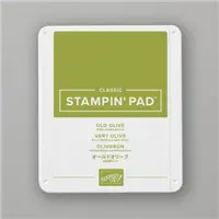
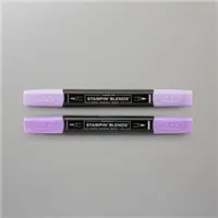
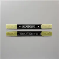
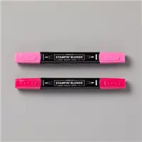
The drink glass is stamped using Highland Heather Ink, as well as the ice cubes. Then I used the Light Bubble Bath Stampin’ Write Marker to “scribble” back and forth for the liquid. I like the varied shades and a bit of white to add the drink details. The lavender is stamped using Old Olive Ink and stamped off for a lighter shade. Then the leaves are colored with Light Old Olive Stampin’ Blend. The flower petals are colored using Light Highland Heather Stampin’ Blends.
PAPERS
This fun paper is one of the best parts of the card. This shows both sides of a sheet from the Celebratory Sips Designer Series Paper. The DSP is part of a suite of products along with the Cheers & Sips Bundle. I paired the DSP with Timid Tiger as the card base and then Peach Pie as the pocket layer.
To create the pocket I cut the Peach Pie layer to 3 3/4 X 5 and the DSP layer to 3 1/2 X 4 3/4. Place the DSP on the layer in place, but do not adhere. Lay on the paper trimmer and mark with a pencil down 2″ on the right side from the top. Now take them apart and cut the DSP from the mark up to the top left corner. This creates the striped piece on the flap when you turn it over to fit the shape. On the Peach Pie layer, do not cut the same way, but Score from the mark to the upper left corner. Fold that over and you are done. I cased this Fun Fold from creativemomentsbyg.
EXTRAS
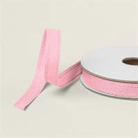
To my surprise there is really not Extras! Granted I did add ribbon to the pull out. It is the Fresh Freesia Faux ribbon. It is a perfect solution for the pull since it is a little narrower and thicker than most ribbon.
MAY STARTER KIT PROMOTION…….
STAMPIN’ REWARDS
The new Stampin’ Rewards begins on April 15. I think you will Love this new version. You will earn rewards on all orders over $20.00 in products The system will track your rewards for you. And they will be available for use on your next order, or you can save up for a larger purchase. All you need to do is on your first order after April 15th is agree to participate. You will then begin receiving rewards on qualifying orders.
Orders of $50.00 or more you will still receive an appreciation gift from me. I appreciate you choosing me as your demonstrator!
COMMENTS
Please know that I love to hear from you and answer any questions you may have. My responses generally are not done here on the post. They are made using my phone as I have found it is easier to answer a question for you personally. So you will be receiving an email from me if you make a comment.
Thank you for stopping by today. I hope you enjoyed today’s project and will come back. I do read and reply to all of the comments individually. They mean a lot to me. Please reach out if you have a question.
Smile and Keep On Stamping,
Jackie
Online Exclusives
New Online Exclusives drop every other month. These are amazing products and are a supplement to the Annual and Mini Catalogs. This way you have access to even more New and Awesome products!
You can go directly to these in my Online Store by clicking HERE
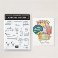
My card to share today is for a dear friend who has reached a major accomplishment. For a big celebration, there should be champagne for all!
STAMPS& DIES
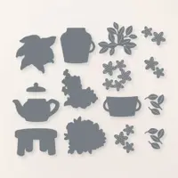
This focal layer was created from three different products. To create the celebration mood, I began with a tub of champagne. These champagne bottles are from the Attention Shoppers stamp set. Three are stamped with a third one fussy cut and layered with dimensionals to stand out. There is a matching Die, but I did not want any white border and these are simple to fussy cut.
The tub for the champagne is from the Country Flowers Die set. And the sentiment stretched across it is from the Sentimental Park stamp set. I thought fussy cutting around it would make it just a bit smaller, and more fun! And finally, the square for the champagne and bucket is cut using the Stylish Shapes Dies. I love the bit of stitching around the edges.
PAPERS
This beautiful paper is the Wildflower Specialty Birthday Designer Series Paper. The colors are perfect for my friend, and I adore the touches of gold. I chose Pretty In Pink from the many colors to be the card base. And went a fancier path by adding Wild Wheat, to mimic gold, for the thin layer. It really works for that when used as a thin layer! The champagne tub was cut using Smoky Slate cardstock.
EXTRAS
To continue the celebration and the gold, I used a trio of the gold dots from Low-Profile Dots. Two are placed as flower centers and the third is on the focal layer. To complete the card I ran a strand of the Pretty In Pink ribbon around the card with a small knotted length on the front.
The initial on the champagne is for my friend. I used the Basic Black Stampin’ Write Marker on the pen end to write the J. It adds a personal touch. That is something I try to do when given an empty spot like this. It is a fun way to personalize your card.
HOST CODE
My FEBRUARY HOST CODE is S2EYAW9N. Orders of $50.00 or more will receive an appreciation gift from me. I appreciate you choosing me as your demonstrator!
Thank you for stopping by today. I hope you enjoyed today’s project and will come back. I do read and reply to all of the comments individually. They mean a lot to me. Please reach out if you have a question.
Smile and Keep On Stamping,
Jackie
New Scrapbooking Catalog
The newest addition to Stampin’ Up! is an Online catalog of Scrapbooking products. You can see the catalog by clicking the photo below and save it to your computer.
Online Exclusives
New Online Exclusives have dropped. There are Halloween, Fall, Christmas, and many that are great year round. Of course the new Designer Series Papers and Embellishments are fabulous as well!
You can go directly to these in my Online Store by clicking HERE
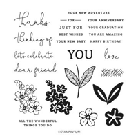
My project to share with you is a seriously quick and a bit of the unusual for me. I have only the sentiment as the stamping on the front of the card.
PAPERS
The Wildflower Birthday Specialty Designer Series Paper is the reason for so little actual stamping. Not only is the striped DSP from that pack, but so is the colorful balloon bundle. There are actually two options for this DSP. One is only the DSP and the other is the DSP plus the sticker sheet. This is from the sticker sheet. I normally prefer to do my stamping instead of precut / colored images. However the sticker sheet in this pack of paper is over the top in terms of color and beauty. In fact the entire pack of paper is probably the prettiest I can remember in a while.
This background sheet of DSP, along with the balloons could be for a birthday, baby shower, or any celebration. I love the soft colors even though I am a Brights person normally. For this card I paired the stripes with the Soft Sea Foam card base and then added the sentiment on a strip of Pretty In Pink.
STAMPS
The sentiment is from the Sentimental Park stamp set. With the smaller size of the fonts here I think it is a good one for inside and front sentiments. To draw a little more attention to the sentiment I flagged the ends with my Paper Snips. I actually raised it with Mini Stampin’ Dimensionals and placed it over the knot in the strings of the balloons.
EXTRAS
To compliment all of the soft colors already existing on the card I kept the bling soft as well. These are from the Party Dots embellishments. They actually are part of the suite of products this DSP is included in. There are three different colors of dots with two different sizes of each. I did one of each color in the larger size.
HOST CODE
My FEBRUARY HOST CODE is S2EYAW9N. Orders of $50.00 or more will receive an appreciation gift from me. I appreciate you choosing me as your demonstrator!
Thank you for stopping by today. I hope you enjoyed today’s project and will come back. I do read and reply to all of the comments individually. They mean a lot to me. Please reach out if you have a question.
Smile and Keep On Stamping,
Jackie
New Scrapbooking Catalog
The newest addition to Stampin’ Up! is an Online catalog of Scrapbooking products. You can see the catalog by clicking the photo below and save it to your computer.
Online Exclusives
New Online Exclusives have dropped. There are Halloween, Fall, Christmas, and many that are great year round. Of course the new Designer Series Papers and Embellishments are fabulous as well!
You can go directly to these in my Online Store by clicking HERE
First thing today I have a reminder about Sale-A-Bration! This is the last few days to get these items at no cost! And there are a few of the second release products that are active in catalogs right now. What a bonus! So don’t miss out. And reach out to me if you have any questions.
Today I am sharing the Spring Corners Bundle and pairing it with a beautiful DSP from SAB. This is one of the fabulous products from this last release of Online Products. They are fun and exciting stamp sets with matching Dies. Plus more are coming in March. The bright Sale-A-Bration DSP pairs perfectly with this fun stamp set.
STAMPS& DIES
The Spring Corners Bundle has a couple of corner sentiments in addition to images that pair with those sentiments. For the front of the I had to use one of the corner sentiments. I think that is such a refreshing idea. And then the group of balloons reinforces the “amazing day” idea.
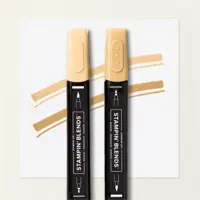
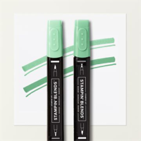
These stampings are done with Memento Tuxedo Black Ink . Then the balloons are colored using Stampin’ Blends. Those colors are pulled form the DSP. This gave me all kinds of color options. So I chose Melon Mambo, Peach Pie, and Shy Shamrock for the balloon colors. These balloons are also stamped on the inside of the card along with a Happy Birthday. For the front the balloons are Die cut with a matching Die. I added Stampin’ Dimensionals under the balloons for depth, but left the bottom free. That allows the bow to sit a little bit flatter.
PAPERS
This unusual mix of cardstock colors are both pulled from the floral piece of DSP. I have been on a Blueberry Bushel kick of late and continued that here. It is just a bright and happy blue. Then to soften things for the DSP pieces, I went with Peach Pie for the layer. It acts as the leading in the stain glass pieced top layer.
The DSP is from the Bloom Impressions Designer Series Paper from Sale-A-Bration. I love these flowers. They are a mix of Brights but with almost all of the color families represented. This makes it so simple to create a variety of cards using different card bases.
The top layer is created with a piece of Peach Pie measuring 4 X 5 1/4. The DSP is all 1″ widths. The top left is 1 X 1, the floral piece is 1 X 4, and the bottom one is 2 3/4 X 1. (Always be careful with your cutting if using directional paper! ) Then the Basic White section is 2 3/4 X 4 to stamp the sentiment.
EXTRAS
There are two Extras, bling and sweet ribbon. The ribbon is the new Daffodil Delight Satin Ribbon. I love this narrow ribbon. It is a breeze to tie a bow with. And then of course bling. Today I chose to use Rhinestones. A sparkle is always needed for a celebration.
Here is the inside view of the card.
HOST CODE
My FEBRUARY HOST CODE is S2EYAW9N. Orders of $50.00 or more will receive an appreciation gift from me. I appreciate you choosing me as your demonstrator!
Thank you for stopping by today. I hope you enjoyed today’s project and will come back. I do read and reply to all of the comments individually. They mean a lot to me. Please reach out if you have a question.
Smile and Keep On Stamping,
Jackie
New Scrapbooking Catalog
The newest addition to Stampin’ Up! is an Online catalog of Scrapbooking products. You can see the catalog by clicking the photo below and save it to your computer.
Online Exclusives
New Online Exclusives have dropped. There are Halloween, Fall, Christmas, and many that are great year round. Of course the new Designer Series Papers and Embellishments are fabulous as well!
You can go directly to these in my Online Store by clicking HERE
The content in this blog is the sole responsibility of Jackie Beers as an Independent Stampin' Up! Demonstrator. The use of and content of classes, services or products offered is not endorsed by Stampin' Up!