I needed a birthday card for a friend who socializes quite a bit. And there are cocktail parties in her neighborhood every week. So I knew exactly the stamp set to use for this card.
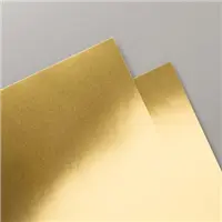
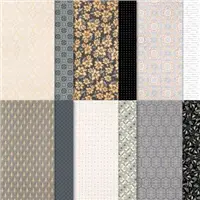
I could not get the foil paper to cooperate in the photo. The foil seemed to deaden the Simply Elegant sheet. It really does shine in person.
Stamps and Dies
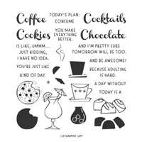
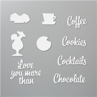
The stamp set I immediately thought of is the Nothing Better Than. It has Cocktails, Chocolate, and Cookies. I went with the Cocktails. There are matching dies, but are no longer a bundle, which are the Love You More Dies. Those three words have dies, as well as a few drinks, cookies, and chocolate pieces. I went with the party drink and the word Cocktails.
Paper and Punch
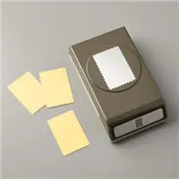
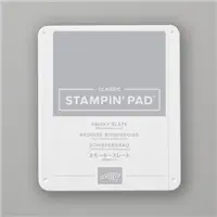
To begin this Cocktail party I started at the bottom, the card base is done with Smoky Slate Cardstock. It pairs well with the silver of the DSP. Next is Gold Foil Paper and then the piece from the Simply Elegant Designer Series Paper. The stamped cocktail is colored with Stampin’ Blends and punched using the Postage Stamp Punch. Even this cute image needed a back layer, so I cut another piece of Gold Foil. That really makes the color in the DSP pop!
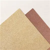
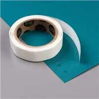
To finish the card I needed the die cut Cocktails. I used the Gold from the Gold and Rose Metallic Paper. This shimmery paper is simply gorgeous. It is adhered to a Foam Adhesive Sheet then die cut. All you have to do then is peal off the backing and you have a Cocktail sticker. That simple step and product makes for such an easy word layer.
HOST CODE
My October Host Code is HSUBS7GX. Please use this code for orders under $150.00. I will have a small gift for those with orders over $50.00 in addition to the Perk Rewards Program. You can read all of the information at the top of the page in the Menu Bar under SHOP / Perks.
Thank you for stopping by today. I hope you enjoyed today’s project and will come back. I do read and reply to all of the comments individually. They mean a lot to me. Please reach out if you have a question.
Before I get to the card I have for you today, have you seen the Clearance Rack Update? There are some really great prices on ribbon and Designer Series Paper. Hop over there now by clicking on the Menu Bar at Shop.
Yesterday I shared a quick and clean card. Apparently I have that on my brain because today’s card is a fairly clean and simple one as well. However, today’s card is a Christmas card. My Christmas card recipients may see this card again!
Stamps
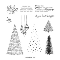
The trees are stamped from one image in the Whimsical Trees stamp set. There are a variety of trees in the set, in a variety of sizes and style. I chose this one with the White cardstock since it has the circles on the tree. These spots could be lights, snow, or ornaments. I choose to think of them as white lights and snow.
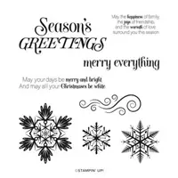
The sentiment is from the awesome stamp set named Merry Snowflakes. (There is more mention of snow! ) I love the wording of the sentiment. This one would work on the front or the inside of a card. But I felt it matched the trees with the white area in what it says.
Ink and Paper and Extras
The three trees are what prompted the Shaded Spruce layer between the White base card and the white layer. I originally planned on simply white on white for the card. After stamping the far right tree using Evening Evergreen Ink, I thought it was a tad too dark. So I stamped the left side tree using Shaded Spruce. That color matched perfect. The center tree is added by inking with Shaded Spruce Ink and stamping off before stamping between the trees.
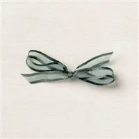
The Sentiment is stamped using the Evening Evergreen Ink. To ground everything I added the Evening Evergreen Open Weave Ribbon across the top. The bow is placed at an angle as to not cover part of the sentiment. Actually I really like the bow like this. The finishing touch is a single Rhinestone placed on the tallest tree.
HOST CODE
My October Host Code is HSUBS7GX. Please use this code for orders under $150.00. I will have a small gift for those with orders over $50.00 in addition to the Perk Rewards Program. You can read all of the information at the top of the page in the Menu Bar under SHOP / Perks.
Thank you for stopping by today. I hope you enjoyed today’s project and will come back. I do read and reply to all of the comments individually. They mean a lot to me. Please reach out if you have a question.
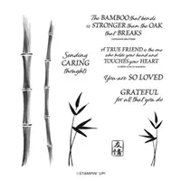
I purchased the stamp set I am showing today for the explicit reason of making quick and clean cards. Sadly that was a couple of months ago and this is the first time I have broken it out. I will say that it will not be the last. I love the definition in the stamps!
Stamp Set
This Bamboo Beauty stamp set is simply elegant looking to me. The simple lines of the bamboo are perfect for a variety of backdrops. And the group of sentiments are all sweet and done in mixed fonts. I love when Stampin’ Up! does that.
The sentiment I chose to use is short and sweet. But really can mean quite a lot to someone. By only using the two bamboo pieces and then the simple sentiment, this becomes a quick, pretty, and meaningful card that would be suitable for a lot of occasions.
Colors
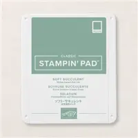
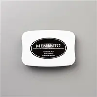
I had a tiny laugh when I typed colors. Because there is not much in the way of color on this card. The base of the card is Thick Basic White, followed by a layer of Basic White that is raised with Stampin’ Dimensionals. The bamboo is stamped using Soft Succulent Ink. And the sentiment is stamped using Memento Tuxedo Black Ink.
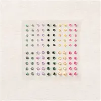
The decorations for the card are limited as well. I added three of the 2021-2023 In Color Jewels in the Soft Succulent color. This was truly a quick and easy card. It would make a great card when making multiples of the same card. Or to use the same layout with different sentiments.
HOST CODE
My October Host Code is HSUBS7GX. Please use this code for orders under $150.00. I will have a small gift for those with orders over $50.00 in addition to the Perk Rewards Program. You can read all of the information at the top of the page in the Menu Bar under SHOP / Perks.
Thank you for stopping by today. I hope you enjoyed today’s project and will come back. I do read and reply to all of the comments individually. They mean a lot to me. Please reach out if you have a question.
I am one of those folks that as I have gotten older I do not like scary. That said, I have a Cute, and Not Scary, Halloween card to share with you today.
Stamps, Punch, Dies
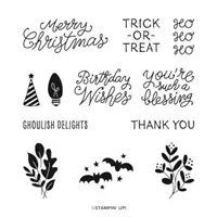
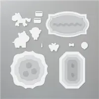
I started this card with the Little Delights stamp set on my desk. The matching image to the Trick or Treat is the bat stamp. I could not envision that on the card with the paper I had pulled. Hippo & Friends Dies were chosen for the sentiment ,as this one fit the sentiment better than any of the punches.
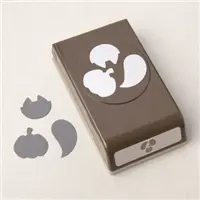
After deciding against the bats, I looked to the Cutest Halloween stamp set. When I saw the ghosts, I knew that was perfect. But instead of stamping the image, I went back to the paper and the Halloween Punch! The Halloween Punch is great with the three different images. It cuts the stamped images as well as the images from the DSP. A Win / Win for my images!
Paper and Embellishments
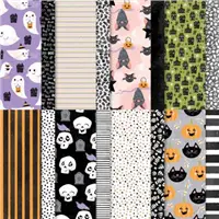
The paper the ghosts came from is included in the Cute Halloween Designer Series Paper. I also chose the two other DSP pieces from that pack. As it turned out, they were not quite large enough. So I added a strip of Basic Black cardstock to the center of a 5 X 3 3/4 piece of Basic White cardstock. Then layered the two DSP pieces on each side totally covering the White layer.
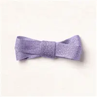
The shiny and beautiful ribbon down the center of the black is the Highland Heather Grosgrain Ribbon. A bow was not necessary as the sentiment layer fills that purpose. The ghosts are layered around the card while they float to the next Trick or Treat location. The finishing touch is a couple of the Black Dots to give the sentiment a bit of bling.
HOST CODE
My October Host Code is HSUBS7GX. Please use this code for orders under $150.00. I will have a small gift for those with orders over $50.00 in addition to the Perk Rewards Program. You can read all of the information at the top of the page in the Menu Bar under SHOP / Perks.
Thank you for stopping by today. I hope you enjoyed today’s project and will come back. I do read and reply to all of the comments individually. They mean a lot to me. Please reach out if you have a question.
I am back from an awesome stamping weekend with some fellow demonstrators, who are also fabulous friends. There was much laughing with some stamping thrown in. I will have some cards to share as the week goes on.
Today’s card is a quick and fun card made with the In Symmetry stamp set. For a set that I didn’t really care for initially, it has become a go to for a quick and easy card.
Stamp set
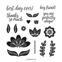
As I said, the stamp set is the In Symmetry set. This bold flower is my favorite from the set. It and the leaves make a great focal point that stamp so well and all you need are the two colors. Being such a solid stamp, both stamps ink up and stamp perfectly.
This sentiment is great for pretty much any occasions. It is just a clean and simple greeting. And who doesn’t love a pretty font? I like that it is not too large or too small. Stampin’ Up! is great for having a variety of sentiment sizes. I have used this one in places similar to this layout, but also on full front stamping and the sentiment at the bottom stamped over the image or in a blank space. The size and bit of boldness allows it to stand out anywhere.
I added the Basic Rhinestone Jewels for some bling to the flower and sentiment.
Paper and Colors
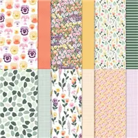
This pretty striped paper is from the Pansy Patch Designer Series Paper. I love the shades of green. And it pairs perfectly with a bold flower. The paper was picked first in terms of color. That led me to the Shaded Spruce for the leaves.
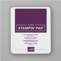
With the leaves being a darker shade I needed a bold color for the flower itself. I have my paper in the Stamp “N Storage shelves behind me. So I took the Shaded Spruce cardstock and actually placed it next to all of the different possible flower colors to determine a match. (A swatch book would work the same way) My little experiment ended up at Blackberry Bliss. It is a color that I haven’t used in a while until the Blackberry Beauty DSP came out in the Mini Catalog. Now I seem to be drawn to it!
Measurements
The card base Blackberry Bliss cut to 4 1/4 X 11, scored at 5 1/2 and folded.
The layer is Basic White cut to 5 1/4 X 4
The DSP from Pansy Patch is cut to 5 1/8 X 3 7/8
The focal layer is Basic White cut to 2 3/4 X 3
The sentiment layer is Basic White cut to 2 1/4 X 3/4
By having the Basic White layer between the card base and the DSP, I did not need a layer under the focal or the sentiment layers. It made for a much thinner card!
HOST CODE
My October Host Code is HSUBS7GX. Please use this code for orders under $150.00. I will have a small gift for those with orders over $50.00 in addition to the Perk Rewards Program. You can read all of the information at the top of the page in the Menu Bar under SHOP / Perks.
Thank you for stopping by today. I hope you enjoyed today’s project and will come back. I do read and reply to all of the comments individually. They mean a lot to me. Please reach out if you have a question.
The content in this blog is the sole responsibility of Jackie Beers as an Independent Stampin' Up! Demonstrator. The use of and content of classes, services or products offered is not endorsed by Stampin' Up!