This month, the theme is “CASE the Catalog” so the Design Team chose a card from the new Annual Catalog and has CASEd it with their own creative twist. We really hope that you are inspired by all the amazing creations the Pals are sharing with you! As you hop from blog to blog, we would love for you to leave a comment. You will find the lineup at the end of my post to help you “hop” along from Pal to Pal.
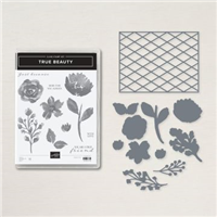
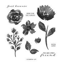
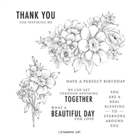
My choice for the CASE the Catalog was on page 66 of the Annual Catalog. This card features the True Beauty Bundle. Having the matching dies, Organic Beauty, for this stamp set is awesome.
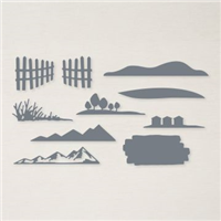
The Bundle
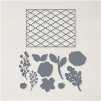
Having this many pieces in the middle of a card is quite different than my normal ones. However in CASEing the catalog, my inspiration was a mix of the framed piece and the green card. Both had layers of flowers. Thankfully the die set makes cutting out the stamped flowers a piece of cake. Plus it was just as easy to add a few of the pieces by simply cutting them out of colored cardstock. And the surprising favorite is the lattice looking background piece.
You may remember a card from last week which had this same lattice look. The piece is large so by cutting it in half, I was able to make two cards from the one die cut.
Paper
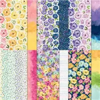
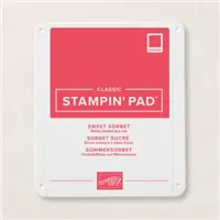
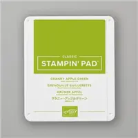
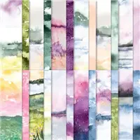
The bright and beautiful colors of the Hues of Happiness Designer Series Paper were where the color choices came from. This piece is actually what would probably be considered the “back” side of one of the roses pieces of the DSP. But these are “Happy” flowers, so they became the star. Sweet Sorbet has grown on me quickly and earned the starring role of this card. Of course the Granny Apple Green and Daffodil Delight always pop as well as being in the floral paper.
Punches and Embellishments
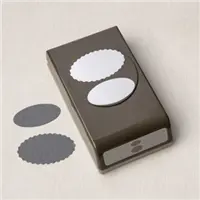
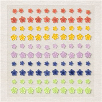
It took some looking through products to decide on how to showcase the sentiment with all of the flower layers. Finally one of my favorite punches won the place of honor. It is the Double Oval Punch. This punch gets used fairly often both together or one of the two used singly. The scalloped edging adds a bit more texture, like more was really necessary, to the card. And to finish this one, I added a few of the Fun Flower Resin Shapes. These were not on my immediate order list. But I am so happy to have them. They almost match the flowers on the paper perfectly!
More inspiration awaits, so use the lineup below to visit the rest of the Design Team. The Pals are excited to show you what they’ve created! Then, please mark your calendars for our next blog hop on July 13th. Our theme will be “Create Your Own Background” when our Design Team creates a background using any technique they wish, such as stencils, stamping, watercolor, embossing but not DSP.
My June Host Code is B4ZVQK6D. Please use this code for orders under $150.00. I will have a small gift for those with orders over $50.00 in addition to the Perk Rewards Program. You can read all of the information at the top of the page in the Menu Bar under SHOP / Perks.
Thank you for stopping by today. I hope you enjoyed today’s project and will come back. I do read and reply to all of the comments individually. They mean a lot to me. Please reach out if you have a question.
The new Sending Smiles Bundle is an awesome one that works fits many occasions. Today’s project is a Sending Sympathy and Love card.
This card is a variety of different products mixed together for an eclectic look. And a different look than I normally create.
Background
There are several different elements making up this different background look. The card base is one of the New In Colors named Orchid Oasis. This color has a really Fresh look to it. Playing off of the flower center brings the Mango Melody paper into the mix. Actually it is a “back” side of the Hues of Happiness paper. The variation of color fit perfectly with my theme.
And finally the lattice looking layer is from the Organic Beauty Dies. Only half of the die cut piece is used and it is cut an an angle. Most of the little filler shapes were left out. It seemed a few were all it needed.
Flower
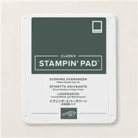
Following along with the richness of the card base, I went with Sweet Sorbet for the flower itself. And the center is Mango Melody matching the background paper. The stem and leaves are stamped using Shaded Spruce Ink. Please do not think the unevenness of the right leaf is poor stamping. This look was actually done on purpose and looks much better in person. I accidentally “slid” the stamp on the ink pad and loved the variegated look that it left.
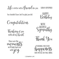
Sentiments
Both of the sentiments are from the Stamp set and Dies. As is the shape for the Comfort & Strength sentiment. You know how I love all in one bundles! Instead of using the little dot of cardstock for dotting the “i”, I added one of the Iridescent Pearls. These are so pretty! And of course I had to add a few more scattered around the lattice section.
HOST CODE
My June Host Code is B4ZVQK6D. Please use this code for orders under $150.00. I will have a small gift for those with orders over $50.00 in addition to the Perk Rewards Program. You can read all of the information at the top of the page in the Menu Bar under SHOP / Perks.
Thank you for stopping by today. I hope you enjoyed today’s project and will come back. I do read and reply to all of the comments individually. They mean a lot to me. Please reach out if you have a question.
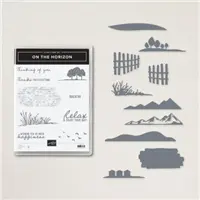
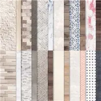
Probably my most favorite paper of all time is the New Horizon Designer Series paper in the Mini Catalog. Fingers crossed that Stampin’ Up! creates a similar paper in the future. In the meantime, I have used this gorgeous paper as a background for a sympathy card.
Paper and Colors
I mentioned the gorgeous On The Horizon Designer Series Paper above. This is a “quiet” scene from one of the pieces. My friend the card is for lives on a cattle ranch. So I thought a bit of early morning mist would work well. Of course, all of the other colors are pulled from the paper.
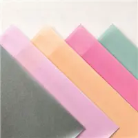
And to add the cute fence, I went with a wood grain paper. It is from the In Good Taste Designer Series Paper. Only a scrap is all it took to cut to the fence. I also added a piece of the 2021-2023 In Color Shimmer Vellum as a layer. This is such pretty paper and you can even see the shimmer in the photo.
Stamps +
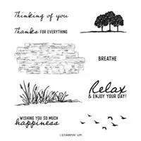
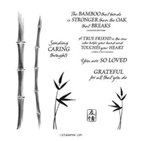
The stamp set used is the On The Horizon stamp set. It is a great Bundle that sadly did not carry over. Included in the Die set is the fence I used on the card. Actually there are two pieces of fence in the dies. The grass at the bottom of the card is from the stamp set. The sentiment is from the Bamboo Beauty stamp set.
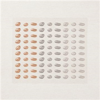
To add some extra texture and look of nature, I added the Pebbles Enamel Shapes. I believe they look very real next to the fence and grass. To angle the layers was, in my way of thinking, a method for showcasing each layer a bit more than is usual.
Last Chance
The products in the Last Chance sale are While Supplies Last. Both this stamp / bundle and the New Horizon DSP are popular and may not last very long! You can click on the photo below to get the full pdf. Or simply click on the shop now in the menu bar to go to my online store. You can see immediately what is still available. Please let me know if you have any questions.
SAVINGS ARE IN BLOOM
CLICK ON THE PHOTO FOR A VIEW OF ALL ITEMS DISCOUNTED
WAVES OF THE OCEAN SUITE …EARLY RELEASE
CLICK ON THE PHOTO TO SEE THE COMPLETE SUITE OF PRODUCTS
ALL TOGETHER … SPECIAL BUNDLE
CLICK ON THE PHOTO TO SEE ALL OF THE PRODUCTS
HOST CODE
My March Host Code is JGGHP66J. Please use this code for orders under $150.00. I will have a small gift for those with orders over $50.00 in addition to the Perk Rewards Program. You can read all of the information at the top of the page in the Menu Bar under SHOP / Perks.
Thank you for stopping by today. I hope you enjoyed today’s project and will come back. I do read and reply to all of the comments individually. They mean a lot to me. Please reach out if you have a question.
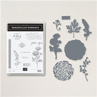
The Ranunculus Romance Bundle was one I overlooked originally. Now I am in LOVE with the elements of this set.
Stamps and Dies
The Ranunculus Romance Bundle may be a little difficult to say, or spell, but it is awesome! In addition to flowers there are postmark, old writing, etc. Plus some great sentiments. I used several of the stamps for this card. I was going for the Time-worn style, which is very different for me.
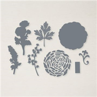
The roses and extra foliage are part of the dies. I randomly and repeatedly stamped the old writing. Then added the ribbon looking long stamp down the side for a bit of a different look. The sentiment is from the Bamboo Beauty stamp set. That is another great set, especially for sweet sentiments.
Paper and Punches
I colored the flowers first to decide on the color palette I wanted. So with Pale Papaya, Soft Succulent and Evening Evergreen as the colors, I looked for a DSP that would work. It was found in the New Horizons 6X6 Designer Series Paper. This is one of the “back sides” of the beautiful water color paper. And this has a watercolor look as well. To better show the paper, I placed the DSP and the focal layer at different angles. Tearing the focal layer was another nod to the time-worn look.
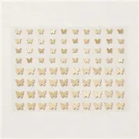
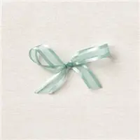
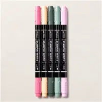
For a finishing touch, and sadly it doesn’t show well in the photo, I flicked the Pale Papaya, Evening Evergreen, and Soft Succulent Stampin’ Write Markers over the focal layer. I had left too many blank spots for the look I wanted. To show off the sentiment, I stamped it and then punched the layers using the Double Oval Punch. This punch is a Must Have in my opinion. And the final touch is the Soft Succulent ribbon around the flowers. Also there is one little Brass Butterfly floating on the largest flower.
Sale-A-Bration is the Best Time of Year!!
HOST CODE
My February Host Code is HFEQADCZ. Please use this code for orders under $150.00. I will have a small gift for those with orders over $50.00 in addition to the Perk Rewards Program. You can read all of the information at the top of the page in the Menu Bar under SHOP / Perks.
Thank you for stopping by today. I hope you enjoyed today’s project and will come back. I do read and reply to all of the comments individually. They mean a lot to me. Please reach out if you have a question.
Sympathy cards are unfortunately necessary. Blessings of Home fit the need of necessity and still quite pretty.
Stamp sets
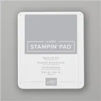
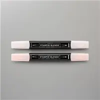
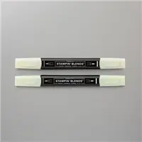
The sweet sentiment I chose is from the Peaceful Moments stamp set. This set has great “caring” type sentiments. I paired this with a subtle, but pretty, flower from the Blessings Of Home stamp set. To have the flower appear softer than usual, I used Petal Pink Light Stampin’ Blends to create a squiggled background. Then stamped the flower with Smoky Slate for a softer outline. To continue the soft, I colored only the leaves with Light Soft Sea Foam Stampin’ Blend. The Pale Papaya shows through for the flower petals.
Colors
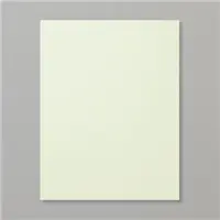
The cardstock colors were chosen from the flower colors. I went with the Smoky Slate card base with a Soft Sea Foam layer. The light green helps the leaves to show off a bit more. On cards with this type layout, the sentiment is not normally the star. But I wanted it to be on this one. So it is stamped using Memento Tuxedo Black for a brighter appearance. The card is finished with a scattering of small Pearls.
Sale-A-Bration is the Best Time of Year!!
HOST CODE
My January Host Code is GR679MMV. Please use this code for orders under $150.00. I will have a small gift for those with orders over $50.00 in addition to the Perk Rewards Program. You can read all of the information at the top of the page in the Menu Bar under SHOP / Perks.
Thank you for stopping by today. I hope you enjoyed today’s project and will come back. I do read and reply to all of the comments individually. They mean a lot to me. Please reach out if you have a question.
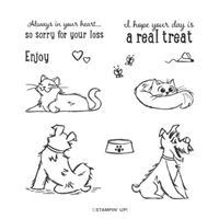
The card for today is to honor a dear friend’s sweet kitty. Any sympathy card is difficult to make. I hope I was able to honor the sweet girl with a simple card.
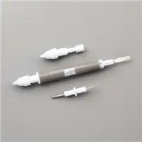
Stamps
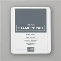
The precious kitty is from the Pampered Pets stamp set. I stamped her with Basic Gray ink and then colored with Smoky Slate Stampin’ Blends. The kitty is fussy cut, which was quite easy as it has pretty simple lines.
The sentiment is from the set as well. Actually the sentiment also says “Sorry For Your Loss” . I wanted a bit smaller wording and also to focus on the “Heart” part of the wording. To achieve this, I inked the part of the sentiment I wanted by using the Basic Black Stampin’ Write Marker. This is the only marker that can be purchased individually. And it is a must have for me! Included in the stamp set are these adorable little hearts. I added them as a compliment for the sentiment.
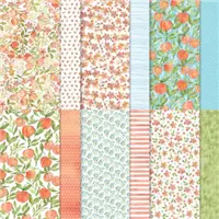
Paper
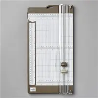
This pretty paper is from the You’re A Peach stamp set. It creates a soft background for the kitty to sit on. The DSP piece is 4 X 3 and cut at an angle. I placed one edge on the trimmer track and the other on the 3/4″ mark. The same was done for both top and bottom.
The base card is Thick Basic White. For a bit of dimension, I added the kitty layer to a piece of Basic White that is cut 4 X 5 1/4. This is then added to the base card with Stampin’ Dimensionals.
Fabulous Stampin’ Up! Join Promotion
Join my team by purchasing the Starter Kit for $75.00 and receive $125.00 of products totally of your choosing! That is a fabulous deal at a $24.00 discount off of the regular Starter Kit price. This is always the Ultimate Bundle of products, and now it is even better! You can simply click on the picture below and Join.
HOST CODE
My November Host Code is M4GF9KZ7. Please use this code for orders under $150.00. I will have a small gift for those with orders over $50.00 in addition to the Perk Rewards Program. You can read all of the information at the top of the page in the Menu Bar under SHOP / Perks.
Thank you for stopping by today. I hope you enjoyed today’s project and will come back. I do read and reply to all of the comments individually. They mean a lot to me. Please reach out if you have a question.
The content in this blog is the sole responsibility of Jackie Beers as an Independent Stampin' Up! Demonstrator. The use of and content of classes, services or products offered is not endorsed by Stampin' Up!