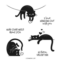
My love of cats is well known. And I purchase every cat set that Stampin’ Up! makes. However, this Love Cats is probably my favorite one yet. I know I have used it a few times, but here is one more!
Stamps
This silly cat may be my favorite from the Love Cats stamp set. He or she is so happy looking while flipped over. I have a 14 year old female cat that every afternoon, while telling us it is dinner time, chases her tail!
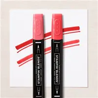
One of the things I love about these cats are that they are solid. So one ink and you have a great image. For this one I simply filled in the heart using Sweet Sorbet Stampin’ Blends. And that was all it took for the focal image.
Papers
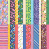
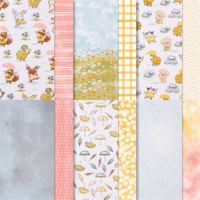
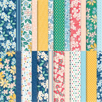
To pair with the silly cat, I wanted a fun paper. All it took was pulling out the pack of Flowers & More Designer Series Paper. This is a Host reward paper in the Mini Catalog. The colors are all fun and bright which is my favorite generally. To pair with the bright, I pulled the brightest of the colors from the paper and went with Parakeet Party for the card base. And then another fun piece of the DSP for the cat layer that would coordinate with the first. These papers make it so easy.
Fold
This is a simple, but Fun Fold. Here is a photo of the open card.
Instead of the fold being at the top as is usual, I flipped the card and have the opening at the bottom. I have done some gift card holders with this orientation. But this card is just a card only.
By clicking on the photo you will be taken to the Online Exclusives in my online store. Please use my Host code if you make a purchase. I would really appreciate it!
HOST CODE
My March Host Code is ZF27VSFC. Please use this code for orders under $150.00. I will have a small gift for those with orders over $50.00 in addition to the Perk Rewards Program. You can read all of the information at the top of the page in the Menu Bar under SHOP / Perks.
Thank you for stopping by today. I hope you enjoyed today’s project and will come back. I do read and reply to all of the comments individually. They mean a lot to me. Please reach out if you have a question.
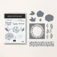
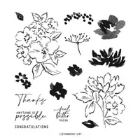
I love making cards and even the occasional sympathy card. They should be just as lovely and special as all of our cards. So this one, which is for a dear friend, was my first play with the Irresistible Blooms Bundle.
Stamps and Dies
The fun die in the center of this card is my most favorite from Stampin’ Up! right now. It is quite different from any other and really pops. The die is from the Irresistible Blooms Dies. I used the stamp set also, but it is on the inside of the card.
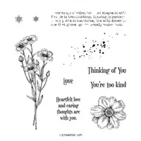
The front sentiment is one that fit my thoughts for this card perfectly. It is from the Potted Geranium stamp set. That set has some awesome sentiments and I will be sharing other cards with it soon.
Paper and Punches
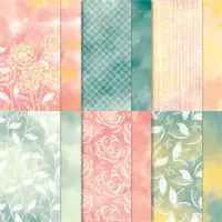
The beautiful paper that is showing from behind the die cut is from the Hello Irresistible Designer Series Paper. That paper is simply beautiful! The different colors are amazing. And it has like an embossed resist look to it. This sheet showing is like it was sponged with soft pastels onto an embossed image. So very pretty!!!
The sentiment is stamped on the reverse of a paper in the same DSP pack. I love the soft Pastel look and went with all pastel colors actually. The card base is Soft Sea Foam card stock. And the layer is So Saffron. It is rare for me to use So Saffron but it is perfect in this case. Plus both of those colors are in that sponged look.
To finish the front of the card I needed something. Instead of die cutting leaves from the Die set. I used the Bough Punch. With a couple of Soft Sea Foam leaves and Petal Pink flower pieces it was complete.
Embellishments
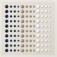
The card is not finished without embellishments. So I miss -spoke above. By spreading some love with Enamel Dots, I was able to add a soft bling to the card. And since it is soft looking, I went a bit heavy on the bling! Those little round areas of the die cut just seemed to be calling for a little embellishment on each. But I did restrain myself and left a few empty.
To see all of the Online Exclusives, click on this photo. You will be taken to my online store and directly to those exclusive offers. Please use my Host code if you are inclined to make a purchase! 🙂
HOST CODE
My March Host Code is ZF27VSFC. Please use this code for orders under $150.00. I will have a small gift for those with orders over $50.00 in addition to the Perk Rewards Program. You can read all of the information at the top of the page in the Menu Bar under SHOP / Perks.
Thank you for stopping by today. I hope you enjoyed today’s project and will come back. I do read and reply to all of the comments individually. They mean a lot to me. Please reach out if you have a question.
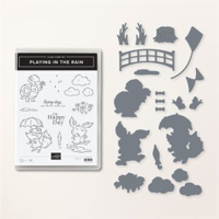
Today’s card is for the Make My Monday Challenge. The challenge is “P is for”. I came up with “Possible”. And used the fun Playing in the Rain for the card idea. Plus the card is a new to me Fun Fold! Woohoo!!!
As I said, this card is for the Make My Monday Challenge. You can see all of the other designers’ cards with this fun challenge by clicking on the icon below. Plus you can add your own take on it at the site as well.
Stamps and Dies
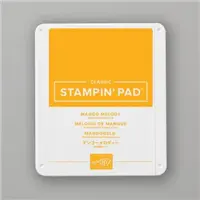
The Playing In The Rain Bundle is such a fun one. Actually I used most of the Suite of products! The stamp set is utilized on the inside of the card, which I will share in a minute. The front stamping is the sentiment. This is from the Hand Penned stamp set. The Possible was exactly what I was looking for to complete the challenge. I stamped it twice, once in Memento Black Ink and the other in Mango Melody Ink. Because the words were so very close together, it was simpler to stamp twice and then carefully cut what was needed. To adhere them back together was then pretty easy.
The Die used is the turtle. I used a die to cut him from the DSP. As much as I love to color, I cannot really do better than the SU artists that created the paper! Oh how I wish I was that talented!! So I took the easier route and die cut him.
Papers
All of the papers are from the Rain or Shine Designer Series Paper. The checked pieces are the reverse of the daisy and sky sheet. That makes things really simple! I pulled the card base from the sky and then added a piece of Basic White to separate the DSP from the base.
Embellishments
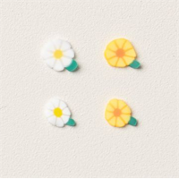
The fun Loose Daisy Embellishments are so adorable! There are quite a lot of them in both yellow and white and in different sizes. They are not adhesive backed, but a little glue dot takes care of that easily. I scattered a few around on the left edge and then at the sentiment.
Fun Fold
I cased this Fun Fold from Connie Stewart. She calls it a Simple Twist card. I call it a Wow card! It may look like a Book Fold card, BUT….it has a Twist to it. Here is the open card.
This card is made like the book fold card that is scored and folded diagonally and stands up on the front. Except this one Twists! When it twists it turns from a vertical card into a portrait layout card with the front section now at the top of the open card. How fun is that??? I was so excited! And now you can see the stamps from the Playing In The Rain set that I used on the inside.
Reminder to check out the Online Exclusives!! Click on the photo and you will be taken to my online store and directly to the exclusives. Please don’t forget to use my host code if you really must have an item, or two!
HOST CODE
My March Host Code is ZF27VSFC. Please use this code for orders under $150.00. I will have a small gift for those with orders over $50.00 in addition to the Perk Rewards Program. You can read all of the information at the top of the page in the Menu Bar under SHOP / Perks.
Thank you for stopping by today. I hope you enjoyed today’s project and will come back. I do read and reply to all of the comments individually. They mean a lot to me. Please reach out if you have a question.
Today’s card is a simple fold that holds a small bookmark. It was inspired by a friend who has been cross-stitching bookmarks. Mine is quite a bit smaller, but still functional.
Paper
The paper is the prettiest part of this card in my opinion. I used the Regency Park Designer Series Paper. There are three different patterns used. The flowers on the bookmark look similar to the ones at the bottom, but are gold outlines instead of light blue with gold centers. One of my favorite things about Stampin’ Up! DSP is how they coordinate so well. Note: With the speed that items are selling out, this card would be perfect with any of the SU papers you have on hand since there is no stamped image.
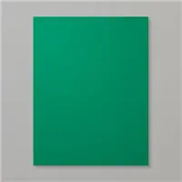
To choose the complimentary colors was a bit difficult. There are several options from the different DSP pieces. But I ended with Shaded Spruce as the card base. It is in the two floral pieces and compliments the Mango Melody layer as well.
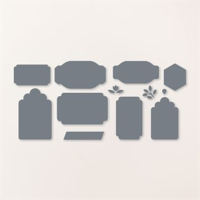
Dies
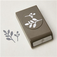
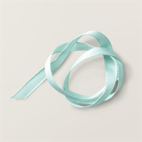
The Dies I used for the book mark are from the Something Fancy Dies. I love the fun sentiments that pair with the Dies. But the Dies are amazing alone. There are a couple of different layering shapes. This one is two sizes as you see. The shape is perfect for a bookmark. And so easy to simply die cut a fairly small one. Although it is large enough to actually use! I added the Pool Party Grosgrain Ribbon as the pull. The hole was created with an old hand held hole punch.
Stamps
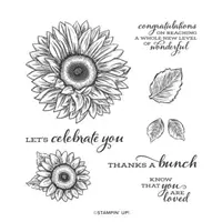
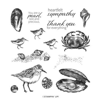
The sweet sentiment on the front is from the Celebrate Sunflowers stamp set in the Annual Catalog. That font is so pretty and it really stands out as the focal point of the card front. The inside sentiment is also from that set. Since the bookmark is relatively plain, I added a sweet surprise on the back. And then I did not photograph it! Duh!!! I stamped a sentiment on the back of the bookmark from the Seaside Bay stamp set. It says “You are a pearl, rare and precious”. I thought that is a sweet sentiment to give to a friend.
Here is a view of the inside of the card.
Bling
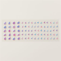
There must be bling on almost all of my cards. This one has more than usual. I am now in love with the Iridescent Rhinestones! They take a bit of the colors they are placed around. There is one on the bottom section of the DSP, two on the sentiment, and two on the tag. There are three different sizes and I used all of them. Spread the love around!!
Directions
The card base of Shaded Spruce is cut 4 1/4 X 11 and scored at 1 1/2 and 5 1/2. Fold and burnish the score lines, and then fold the small one up to form the pocket. Add the DSP piece , 4 X 2 1/2, before securing that fold with Tear & Tape on each edge. The DSP extends a bit beneath the fold for an easier fit and cleaner look. The sentiment strip is cut to 4 X 1 1/4.
The inside layer is a piece of Basic White that is 4 X 5 1/4. And the DSP piece is 4 X 1 1/2. It fits flush with the bottom and sides of the card so the white does not show with the card closed. For the tag I die cut a Shaded Spruce that was 2 1/4 X 3 1/2 and the DSP was 2 X 3.
Thank you for stopping by today!!!
Click on the photo to be taken to my Online Store for the Online Only Exclusives…..
HOST CODE
My March Host Code is ZF27VSFC. Please use this code for orders under $150.00. I will have a small gift for those with orders over $50.00 in addition to the Perk Rewards Program. You can read all of the information at the top of the page in the Menu Bar under SHOP / Perks.
Thank you for stopping by today. I hope you enjoyed today’s project and will come back. I do read and reply to all of the comments individually. They mean a lot to me. Please reach out if you have a question.
Today I have created one of the Floating pieces that has been shared quite a lot of late. Since i have been making quite a few cards, there were tons of scraps hanging around. And that is all you need for these type focal points.
Technique
This Floating technique has been around for a while and I finally decided to give it a try. There are quite a few directions and videos. So I will not go in depth. I will say that all I did was cut the card stock in 3/4″ heights and adhere them to a piece of the thick acetate that photopolymer stamps come attached to. Next you die cut a circle or any shape. It does take several run throughs with the Cut & Emboss Machine. Even then I had to use my Paper Snips to finish cutting in a few places. And that is it!! All that is left is placing Adhesive Strips along the back on each strip. This is what makes it appear to float. Easy Peasy!!
Papers
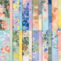
This Floating technique is all about the paper. However I went a bit overboard on the paper. After my Wisteria card last week using the Fancy Flora Designer Series Paper, I wanted to use it again. From all of the cards like this I have seen, they all are pretty clean. Mine is not clean! I began with the DSP layer and chose colors from it to use for the Floating part. In doing that I ended up using all of the outgoing In Colors. It is a great way to use up the scraps of these, or any, colors.
Stamps and Dies
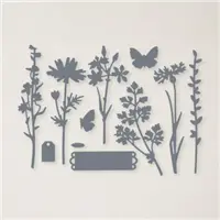
In addition to the Layering Circles Dies for the Floating piece, I used the Quiet Meadow stamps and Meadow Dies. The stems are cut from Pretty Prints Designer Series Paper scraps. As is the butterfly. I love the different shades on each of those for definition. And what a great way to continue using scraps that might otherwise not get used. The only “stamped” piece is the little tag. That is from the stamp set as well. And I adore the little tag from the Dies. It is added with a glue dot and a fake bow using White Bakers Twine.
There is no bling on this card! That is definitely different for me. But it was extremely “busy” already! The spots on the right side of the floating panel may look like white bling. They are actually reflections from the clear plastic with the lights of my light-box. I did not realize they were there until I began this post. Sorry about that.
Thank you for stopping in today!!!
Click on the photo to be taken to see all of the Online Exclusives……….
HOST CODE
My March Host Code is ZF27VSFC. Please use this code for orders under $150.00. I will have a small gift for those with orders over $50.00 in addition to the Perk Rewards Program. You can read all of the information at the top of the page in the Menu Bar under SHOP / Perks.
Thank you for stopping by today. I hope you enjoyed today’s project and will come back. I do read and reply to all of the comments individually. They mean a lot to me. Please reach out if you have a question.
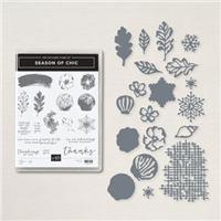
I have been looking through stamp sets from the Annual Catalog to see what I have not been using. The Season of Chick jumped out at me. The paper has always been a favorite, but I haven’t really used the stamp set as much. And with both the Mini and the Annual getting ready to retire, it seemed the perfect time to break it out. Plus I have a fun use for the paper.
Stamp and Die Bundle
It is difficult to pick a favorite part of this card. I love the papers, but also the flower and the Die cut layer. The bundle is the Season of Chic with the matching Chic Dies. That open weave layer is from the Die set. It really adds a lot to the card. The flower and sentiment are from the stamp set. The flower is a two step that is done in Smoky Slate and Petal Pink.
Papers
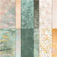
The Texture Chic Designer Series Paper is part of the Season of Chic Suite of products. So of course it was the perfect choice to pair with the bundle products. I love the soft and shine together. The fun pleating is done with a piece of the DSP. I found several versions of how to do the pleating on Pinterest and YouTube. Mine is sort of a mixture of a few.
To compliment the gold in the papers, and to cover the top of the pleating, I used the Gold and Rose Gold Specialty paper from the Annual Catalog. Just a strip was all that I needed. The open weave Die cut layer is also a scrap piece of the Textured Chic paper. The gold seems to pop even more after being Die cut!
Finishes
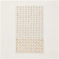
To complete the card I used the Banners Pick A Punch to flag the end of the sentiment strip. Then it is tucked under the flower. Of course there has to be bling! So I scattered some of the Flat Adhesive Pearls around the card and for the flower center. These remind me of Fresh Water Pearls with the different shapes and luster.
Thank you for stopping by!!
Click on the photo to see all of the Online Exclusives Products…….
HOST CODE
My March Host Code is ZF27VSFC. Please use this code for orders under $150.00. I will have a small gift for those with orders over $50.00 in addition to the Perk Rewards Program. You can read all of the information at the top of the page in the Menu Bar under SHOP / Perks.
Thank you for stopping by today. I hope you enjoyed today’s project and will come back. I do read and reply to all of the comments individually. They mean a lot to me. Please reach out if you have a question.
The content in this blog is the sole responsibility of Jackie Beers as an Independent Stampin' Up! Demonstrator. The use of and content of classes, services or products offered is not endorsed by Stampin' Up!