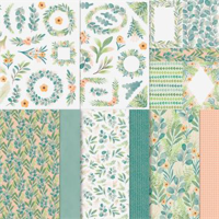
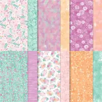
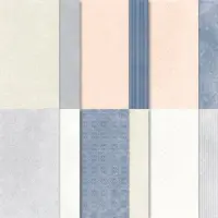
The fun Frames & Flowers Designer Series Paper and the To Market Designer Series Paper are what today’s project is all about. Seriously, it is almost all made using pieces of paper!
Papers
To create a card using almost all paper makes for a quick and easy card. And that is definitely today’s card. I pulled the card base of Lost Lagoon from the strip of DSP. That strip is from the piece of Frames & Flowers Designer Series Paper that has ready made layers that can then be cut apart. I thought the strip was beautiful with the mix of colors and wanted it to be a star of this card. The flowers around the sentiment are also from that pack of paper. There are quite a lot of “punch out” pieces. And these are some of those.
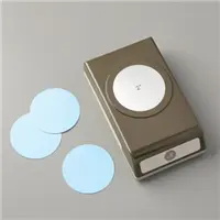
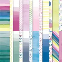
The layer of DSP is from the To Market Designer Series Paper. I thought the colors match the flowers perfectly. Then I used Circle Punches to make the sentiment layers with a scrap of Lost Lagoon and some Basic White. Easy Peasy card!!!!
Stamps and Extras
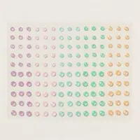
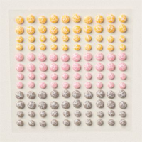
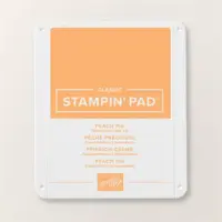
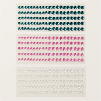
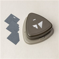
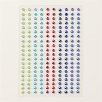
The single “hello” stamp is from the sweet Poised Peony stamp set. I like the boldness of the fun font. As I mentioned the circle punches above, they are the 1 3/4″ Circle and the 2″ Circle Punches. And to finish the card, I added a trio of the 2024-2026 In Color Shimmer Gems in Peach Pie. Two are in the flower centers and one is extra and grounding the white circle.
Thank you for stopping in today!!!!
Extra 10% on Bundles, and the Stamp Cut & Emboss Machine, both regular and Mini…
HOST CODE
My JUNE Host Code is VGC9HN6B. Please use this code for orders under $150.00. I will have a small gift for those with orders over $50.00 in addition to the Perk Rewards Program. You can read all of the information at the top of the page in the Menu Bar under SHOP / Perks.
Thank you for stopping by today. I hope you enjoyed today’s project and will come back. I do read and reply to all of the comments individually. They mean a lot to me. Please reach out if you have a question.
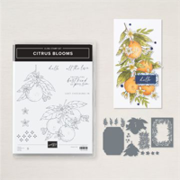
I have really come to love the Citrus Blooms Bundle and papers. At first I thought there was limited possibilities with the stamps, and I was very wrong!!!
Stamps and Dies
This card was cased from one I found online and I apologize to whoever the creator is as I cannot find where I wrote down the name! But I truly love the card. The layout is what originally drew me to this card. It is one I will definitely use again. And having the Citrus Blooms stamp set orange image to highlight with this layout was a winner. I stamped the image using Memento Tuxedo Black and colored it with Peach Pie and Old Olive Stampin’ Blends.
The sentiment is another favorite from the stamp set. I love the sentiment. It is a little different and I think would really make someone feel special. The matching Citrus Blooms Die set is just as wonderful as the stamps. I used a Die to cut out the orange image as well as the little yellow flowers. There are two different citrus images with matching Dies and a variety of extras.
Papers
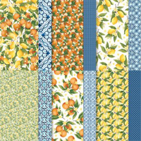
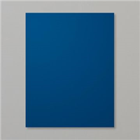
The blues are the star of this card every bit as much as the citrus image. I love blue and this uses my two favorite card stock blues of Night of Navy and then Boho Blue. But the gorgeous DSP is fabulous. This is from the matching Mediterranean Blooms Designer Series Paper. One side is different blue papers and the other is different citrus images. I used two different blue patterns with both layered on Boho Blue card stock. To add a touch more color, I used Daffodil Delight to cut the little flowers.
Extras
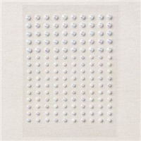
The little yellow flowers mentioned above are part of the Extras, as well as the stamping on the Boho Blue strip. To add some more bling, I added small Iridescent Pearls to the yellow flowers and then a larger one next to the sentiment. I hope you like this card as much as I do!!
Thank you for visiting today!!! And do not forget that this Bundle is now discounted another 10% thru the end of the month!!! Woohoo!!!
Extra 10% on Bundles, and the Stamp Cut & Emboss Machine, both regular and Mini…
HOST CODE
My JUNE Host Code is VGC9HN6B. Please use this code for orders under $150.00. I will have a small gift for those with orders over $50.00 in addition to the Perk Rewards Program. You can read all of the information at the top of the page in the Menu Bar under SHOP / Perks.
Thank you for stopping by today. I hope you enjoyed today’s project and will come back. I do read and reply to all of the comments individually. They mean a lot to me. Please reach out if you have a question.
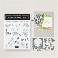
I have used the Lily Pond Lane DSP a few times. Today I pairing with the stamp bundle it coordinates with. That tis the Charming Duck Pond Bundle. This is another card that I cased from the Annual Catalog, but changed up to work for my Club.
Stamp Bundle
The Charming Duck Pond Bundle includes some awesome ducks, greenery, sentiments, and a few extras. And the matching Dies are just as great. My favorite probably is that there are two ducks facing opposite directions. This allows you to cut the ducks from the DSP easily and create fun cards. Since this card was for my Club, I opted to use one of the different ducks for my card and saved the two with matching dies for the club ladies. And I love fussy cutting, so this was not a big sacrifice for me!
The frog has a matching die, but I chose to stamp directly on the White piece. And I love the sentiment. This is great for so many occasions. The font is great as well! This greenery and flowers, although I think they are really water lilies, are great. Each of the three dies create two of the item. So less cutting is always a good thing. I added the extra of the larger flower on the inside of the card for a small extra touch there.
Papers
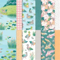
The DSP here are from different packs of paper but work perfectly together. The background orange speckles is from Unbounded Beauty Designer Series Paper. Because I have a large club, I went to a 12 X 12 pack as the Lily Pond DSP is only 6 X 6. But I do not believe anyone would question this pairing of orange colors. And the gorgeous orange and cat tails paper is from the Lily Pond Designer Series Paper. Since this is a 6 X 6 paper, I cut each sheet into 3 X 3. It needed to be larger, but there was not enough paper. I improvised by placing it higher up on the card and then adding the Basic White a bit taller to make up the difference. No one would know if I didn’t tell on myself!!
The card base is Pretty Peacock that is cut to 4 1/4 X 11. With the orange DSP at 3 1/2 X 4 3/4. I already said the cat tails DSP is 3 X 3 and the Basic White is 3 X 1 1/2. For the Die cut greenery I went back to the Pretty Peacock and added flowers of Petal Pink.
Finishes
To complete the card I added a single Adhesive Backed Dapple Dots near the duck. I raised the duck using Stampin’ Dimensionals. Also I only adhered the cat tails at the bottom. Then added the flowers using a glue dot on each. That further secured the cat tails without having a sticky mess. And I can easily do that trying to add adhesive to a tiny place.
Thank you for stopping in today!!!
Extra 10% on Bundles, and the Stamp Cut & Emboss Machine, both regular and Mini…
HOST CODE
My JUNE Host Code is VGC9HN6B. Please use this code for orders under $150.00. I will have a small gift for those with orders over $50.00 in addition to the Perk Rewards Program. You can read all of the information at the top of the page in the Menu Bar under SHOP / Perks.
Thank you for stopping by today. I hope you enjoyed today’s project and will come back. I do read and reply to all of the comments individually. They mean a lot to me. Please reach out if you have a question.
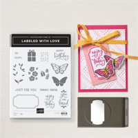
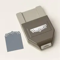
My card today is one that I cased from the Annual Catalog. Of course I made a couple of little changes to make it mine. I used the new Labeled With Love Punch Bundle and am really Loving it!
Stamp and Punch Bundle
There are two stamp sets in the Annual Catalog that give you options for their bundles between Dies and Punches. This is one of them. The other is the Keeping Tabs Bundle. I personally love punches. They are quick to use is the main reason. And this one is a good one. It is the Labeled With Love Punch Bundle. The card I cased is on page 58 of the catalog along with the Bundle. I did not change a lot, but made my shine a bit more!
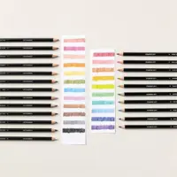
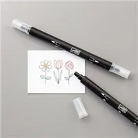
The punch has a stamp to outline the shape. I used Pumpkin Pie for the outline. And to use my coordinating colors, I chose Pretty In Pink for the sentiment inside of the punch shape. There are a couple of awesome sentiments in this set. As well as fun images. I used the butterfly and stamped it twice on scrap paper. They are colored using Watercolor Pencils and a Blender Pen to be different. Stampin’ Blends are my go to for coloring, but a few of my club ladies prefer the pencils.
Papers
There are a mix of very different papers to create this layout. The card base is Petal Pink that is 4 1/4 X 11. Next is a layer of Basic White that is 3 3/4 X 5. The fun circles DSP is 3 1/2 X 4 3/4 and is from the Country Lace Designer Series Paper. This pack is full of soft colors and designs that are more subdued than most. I love them!
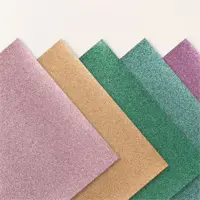
The final piece of Paper is the 2024-2026 In Color Glimmer Specialty Paper. This paper is so pretty, as you can see in the photo. It is shown on page 55 paired with the Unbounded Beauty DSP. These colors are amazing!!! I thought the brightness of the Peach Pie Glimmer paper complimented the softness of the other papers. And I tried to make the butterflies pull some of the brighter orange color as well. Before punching the size of the Glimmer Paper is 2 X 3 3/4.
Extras
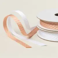
To make the gorgeous tag using the Glimmer Paper, I used the Elegant Edge Punch. Those scallops at the top are elegant but work well with my simple circles and butterflies also. There was a bit too much space between the tag and the top of the tag, so I added a little piece of knotted ribbon. This is the Petal Pink & White Diagonal Trim Combo Pack. This is a soft pink but I think will be great with quite a few colors. The butterflies were positioned as buddies at the bottom. Even with bling from the Glimmer Paper, I added one single Sequin at the top of the punched label.
Thank you for stopping by today!!
Extra 10% on Bundles, and the Stamp Cut & Emboss Machine, both regular and Mini…
HOST CODE
My JUNE Host Code is VGC9HN6B. Please use this code for orders under $150.00. I will have a small gift for those with orders over $50.00 in addition to the Perk Rewards Program. You can read all of the information at the top of the page in the Menu Bar under SHOP / Perks.
Thank you for stopping by today. I hope you enjoyed today’s project and will come back. I do read and reply to all of the comments individually. They mean a lot to me. Please reach out if you have a question.
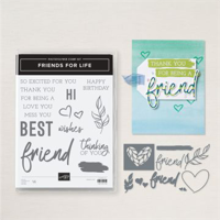
Today’s card is one that I made for a Team swap. I was so surprised how much I fell in love with this Bundle that is Friends For Life. Of course, the matching DSP really adds to the card.
Stamp Bundle
The gorgeous script Die of “friends” is my favorite part of this card. I love the size, font, everything! The other sentiment is part of several words, or groups of words, that can be used to create your own sentiment. Because of the layout of my card, using these partial sentiments was actually the perfect layout to create my full sentiment.
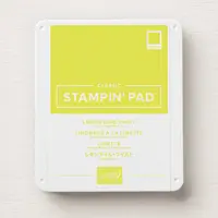
The extra words are stamped using Shaded Spruce and the inside image is in Lemon Lime Twist. Due to the front sentiment, I did not add one to the inside. I thought I would wait until I knew who I was sending it to and then add an appropriate one. So the simple leaf was a great fit. Here is a view of the inside of the card. And you see the “fun Fold” of the card.
Papers and Embossing
The beautiful DSP is from the matching Full of Life Designer Series Paper. This is a 6 X 6 pack of bold and bright designs as well as colors. The blocks down each side of the card are cut from one of the sheets. And the bold “friend” is from another piece. I added Foam Adhesive Sheets to the back of the variegated piece before die cutting it. I love the various colors. The little green heart is also die cut from the same sheet.
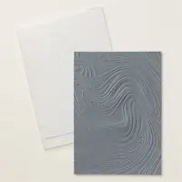
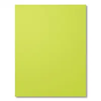
To continue the bold colors, I went with Lemon Lime Twist for the card base. It is also the layer for the front underneath the sentiment. I gave this layer a little bit extra texture by using what has become a favorite embossing folder. This is the So Swirly Embossing Folder. Those swirls are wonderful for any card. The movement is very different. The only finishing touch is a single Rhinestone on the little heart. That is extremely conservative for me!!
Measurements of Fun Fold
The card base is quarter sheet of Lemon Lime Twist card stock (5 1/2 X 4 1/4). The White layer is 5 1/4 X 4. There is also the “small” card attached to the center. You see it in that second photo. It measures 3 3/4 X 8, folded at 4. The side DSP are each 1/2 X 3 3/4. And the swirly embossed Lemon Lime Twist measures 3 1/2 X 3 3/4.
Thank you for stopping in today!!
Extra 10% on Bundles, and the Stamp Cut & Emboss Machine, both regular and Mini…
HOST CODE
My JUNE Host Code is VGC9HN6B. Please use this code for orders under $150.00. I will have a small gift for those with orders over $50.00 in addition to the Perk Rewards Program. You can read all of the information at the top of the page in the Menu Bar under SHOP / Perks.
Thank you for stopping by today. I hope you enjoyed today’s project and will come back. I do read and reply to all of the comments individually. They mean a lot to me. Please reach out if you have a question.
The card I have to share with you today can be a birthday card, or a gift card holder, even an invitation. It all depends on your choice of how to utilize this simple layout.
Stamps
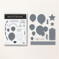
This card was made for a class the end of April. Sadly I forgot to post it. And since I love the layout, I thought you might like it even though the stamp set has been retired. I used the Beautiful Balloons Bundle for this card. The sentiment and the two balloons are both from the set. And the matching Dies were used to cut the balloons. However, there are quite a few sets / bundles that would work just as wonderfully to create a similar card using this layout. Here is a look at the inside.
The inside stamping is also from the same stamp set. I hope you have this fun set in your collection!
Papers
The papers used were pulled from the Bright & Beautiful Designer Series Paper. Even though the stamp set retired, this gorgeous paper did not! Woohoo!!! It is perfect for any celebration. And I love that it matches almost every color we have. For this card I paired it with Lemon Lime Twist as the background.
Extras
There are several “extras” on this one. First, I used the now retired Very Best Trio Punch to make the slot where the ribbon attaches. But any hole punch will work as well. And I used a long ago retired 1″ Circle punch to make the finger cut. Same applies there, any punch you have will work to make a finger slot.
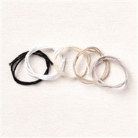
The ribbon is from the Sheer Ribbon Combo Trim in the yellow shade. And the Bakers Twine Essential Pack is the string for the balloons. Last but not least is the 2022-2024 In Color Pearls. And again, there are so many colors in this paper that I am certain you have a color which will work. That is one of the many things I love about Stampin’ Up! products! If you are missing one piece, substitute something similar and you are good.
Measurements
There are two different ways to create this card. This one is made with the pull out as the actual “write on it” card. But you could make that an invitation to a party, or attach a gift card there. If you wanted to make a gift card holder, simply use a full size card as the card base. For this one, I only used a quarter sheet of card stock. If you have any questions about any of that, please reach out to me, I will be happy to help you figure it out.
The card base for this card is 4 1/4 X 5 1/2. And the large DSP layer is 4 X 5 1/4. The pull out layers are 3 1/2 X 4 1/4 for the card stock, and 3 1/4 X 4 for the Basic White focal layer. Also the strip of DSP across that layer is 2 1/4 X 3 1/2. For the pull out, you need Basic White that is 3 X 4. This gives you some wiggle room and not such tight fit. However you do need to place you adhesive right up to the edge at the sides and bottom.
Thank you for stopping by today!!!
Extra 10% on Stamp & Die Bundles, and the Stamp Cut & Emboss Machine, both regular and Mini…
HOST CODE
My JUNE Host Code is VGC9HN6B. Please use this code for orders under $150.00. I will have a small gift for those with orders over $50.00 in addition to the Perk Rewards Program. You can read all of the information at the top of the page in the Menu Bar under SHOP / Perks.
Thank you for stopping by today. I hope you enjoyed today’s project and will come back. I do read and reply to all of the comments individually. They mean a lot to me. Please reach out if you have a question.
Reminder that the additional 10% off on Bundles and Machines begins today!!
My card to share with you is a fairly quick one that is bright in color. I love the bright colors of the Color Families of Stampin’ Up!. And this one is mostly in the pink family. A mix of bright and soft, with a sparkle color to highlight everything.
Papers
The prettiest parts of this card seem to come from the paper in my opinion. The background DSP is from the Unbounded Beauty Designer Series Paper. I really love this pack of paper. Also the floral strip with the sentiment is the opposite side of this pink striped piece.
The star though is the glimmer paper. This is from the 2024-2026 In Color Glimmer Paper in Shy Shamrock. It gives just enough glam to make this card. And it ties in with the green floral strip I mentioned. Because of the brighter colors, I kept the card a simple Basic White.
Dies
The Die set used for the floral part is the Flowers of Beauty Dies. It is the perfect backdrop for a quick card. The green stem is the In Color Glimmer Paper. And the flowers are from the Die set as well. They are on a strip that cuts all of the ones you see at the same time. Talk about a time saver!! I used Bubble Bath card stock for these. Also I took a quick and easy route to adhering them. I used a Mini Glue Dot behind each one. There are holes in the centers. But my pearls at the end also fit perfectly in the holes!
Stamps and Finishes
The front sentiment is from the awesome Sentimental Park stamp set. This sentiment gets used quite often by me. It can work with a variety of occasions. And I really love the font used on it. With the glimmer paper and DSP, there was not a need for too much extra. But of course I did add extras!
The scrap of floral DSP from Unbounded Beauty Designer Series Paper was just enough to ground the sentiment of Bubble Bath. I also added a simple multi looped bow to the back of these layers. The Essentials Bakers Twine is definitely something we all should have in our stash. And to finish the card, I added a scattering of Iridescent Pearls.
Thank you for stopping in today!!!
Extra 10% on Bundles, and the Stamp Cut & Emboss Machine, both regular and Mini…
HOST CODE
My JUNE Host Code is VGC9HN6B. Please use this code for orders under $150.00. I will have a small gift for those with orders over $50.00 in addition to the Perk Rewards Program. You can read all of the information at the top of the page in the Menu Bar under SHOP / Perks.
Thank you for stopping by today. I hope you enjoyed today’s project and will come back. I do read and reply to all of the comments individually. They mean a lot to me. Please reach out if you have a question.
I wanted to do a quick reminder that the June Special of an additional 10% off on Bundles begins tomorrow. Or tonight if you are staying up really late!
Additionally, this 10% extra applies to both of the Stamp Cut & Emboss Machines. Woohoo on that one! I would be lost without my machines. And I truly do utilize both of them.
There are currently a few Bundles that are not available. However, all of those are expected back in stock during June. Even if it is the last week of June. But with a new catalog, I am sure you can find a bundle or two on your wish list.
Please reach out if you have any questions.
Extra 10% on Bundles, and the Stamp Cut & Emboss Machine, both regular and Mini…
HOST CODE
My JUNE Host Code is VGC9HN6B. Please use this code for orders under $150.00. I will have a small gift for those with orders over $50.00 in addition to the Perk Rewards Program. You can read all of the information at the top of the page in the Menu Bar under SHOP / Perks.
Thank you for stopping by today. I hope you enjoyed today’s project and will come back. I do read and reply to all of the comments individually. They mean a lot to me. Please reach out if you have a question.
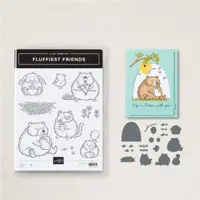
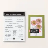
I have really mixed products and patterns today in the card I created. The Fluffiest Friends meets To Market Designer Series Paper. Not a normal pairing for sure.
Papers
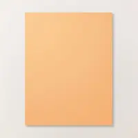
The papers used on this card seem to pop out the most. They are definitely an odd mix, but one that seemed right for some reason. I love the Blackberry Bliss plaid in the background and for the notched ribbon hanging down. But I also loved the floral paper. And when layed down together they seemed to work. It may be a bit busy for some of you and I totally get that. I tried to soften it with the Peach Pie layer behind the kitty. Who knew that Blackberry Bliss, and Peach Pie worked so well together! These papers are both from the To Market Designer Series Paper. I was very unsure about this pack of DSP, but now not so much.
Stamps and Dies
The stamps and Dies used here are probably a first for me. Both the Fluffiest Friends Bundle and the Comforting Thoughts stamp set are OnLine Exclusives. I tend to forget about these items. Now I have them separate, but right next to my Annual Catalog sets.
The Fluffiest Friends, and matching Dies, are so cute and of course that puts them right up my alley. I love cats and these are adorable. This one is so sweet holding the little flower gift. I used the matching Dies to cut him out and he fits perfectly.
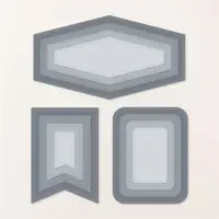
The shape for the background of Peach Pie is from the Nested Essentials Die set. I used the largest in this shape. I also used that die to cut the edges of the White strip. This stamp is from the Comforting Thoughts set. It also fit perfectly with the width of the layer. And matching the stitching for it to fit exact was a piece of cake.
Finishes
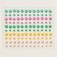
To be such a bright and patterned card, it is also a simple card. It did not require a lot of extras. Of course there has to be some type of bling. In this case, I opted for non shiny bling. The 2024-2026 In Color Resin Dots fit perfectly between the words of the sentiment. (There are dots between the words and I covered them with the In Color Dots). I also used the large size dot as a holder at the top of the banner strip.
Thanks for stopping by today!!!
Extra 10% on Bundles, and the Stamp Cut & Emboss Machine, both regular and Mini…
HOST CODE
My JUNE Host Code is VGC9HN6B. Please use this code for orders under $150.00. I will have a small gift for those with orders over $50.00 in addition to the Perk Rewards Program. You can read all of the information at the top of the page in the Menu Bar under SHOP / Perks.
Thank you for stopping by today. I hope you enjoyed today’s project and will come back. I do read and reply to all of the comments individually. They mean a lot to me. Please reach out if you have a question.
Before we get to the card today, there is a wonderful special coming soon. There is a photo card at the bottom of the post. But the special part is that June 5 – 30, you get an additional 10% off the cost of a Bundle. That makes a total of 20% !! Woohoo!! And the 10% also goes towards either of the Stamp Cut & Emboss Machines as well.
My card today is another version of my new favorite gift card holder. This one was made for a sweet young lady for graduation. It is all about Pink.
Papers
This card really highlights the beautiful Unbounded Beauty Designer Series Papers. These shades of pink all work great together and are easy to mix with other pink shades. I chose to use one sheet as the front and then divide it between the two sections. I showcased this card previously with all of the measurements. And I used the same for this card. You can the previous card and measurements HERE.
The DSP and layers are 4 X 4 and 1 X 4 for the White. Then 3 3/4 X 3 3/4 and 3/4 X 3 3/4 for the DSP. You also need a second 3 3/4 X 3 3/4 White for the inside. Here is that view.
The gift card tucks into the DSP section at the bottom of the card. It will even hold most cards still with the covers on.
Stamps and Bundles
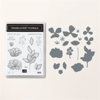
The front flowers are from the Translucent Floral Bundle. This is an Online Exclusive that has carried over from another catalog. It is very popular and one that I find myself drawn to. The flowers are so delicate looking. And with the matching Dies, which also have extra greenery, it is a Win for sure.
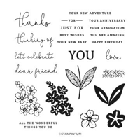
The front sentiment is from the Wonderful Thoughts stamp set. I love that elegant script. The inside sentiment is from the Everyday Details stamp set. Graduation is definitely a New Journey!! And the little stamped sprig is from the Translucent Florals. For this card, a greenery can be pink!
Finishes
To complete this card I added different types of bling. First is the Sheer Ribbon Combo Trim in a soft pink. It is a little hard to pick out in the photo. But it helps to ground the sentiment and add a little more softness. And of course, there must be bling! I have scattered several Basic Rhinestone Jewels around the card. Plus I did add just a scrap of the beautiful DSP to the inside of the card as well. Something a little different.
Thank you for stopping in today!!!
Extra 10% on Bundles, and the Stamp Cut & Emboss Machine, both regular and Mini…
HOST CODE
My JUNE Host Code is VGC9HN6B. Please use this code for orders under $150.00. I will have a small gift for those with orders over $50.00 in addition to the Perk Rewards Program. You can read all of the information at the top of the page in the Menu Bar under SHOP / Perks.
Thank you for stopping by today. I hope you enjoyed today’s project and will come back. I do read and reply to all of the comments individually. They mean a lot to me. Please reach out if you have a question.
The content in this blog is the sole responsibility of Jackie Beers as an Independent Stampin' Up! Demonstrator. The use of and content of classes, services or products offered is not endorsed by Stampin' Up!