Sometimes it is difficult for me to create one card. I have two different versions of the same card to share with you today and tomorrow. From the front they look similar. The difference is in the cut and fold. But both star the Silly Goose.
The Cut
I am sharing the Fun Fold version first. This card was made for a class a couple of weeks ago. I found this cut on Pinterest but did not make note of the name as there were a few by different stampers. If you look closely at the top edge of the goose layer, you can see the cut that gives you a clue it is a Fun Fold.
Here is the open view
To make the cut, I measured with a ruler from the top right edge of the card front, down 3 3/4 and placed a tic mark with a pencil. And then marked the same 3 3/4 in from the edge going across the top towards the fold. Next I placed the two tic marks on the paper trimmer and cut off that triangle of card. It is an easy but fun design.
Note: Do you remember the Fold where you fold back the top layer from the upper right corner and make a fold onto the front of the card? This is almost the same idea, just cut that off instead of folding it down. Here is a version of that from two years ago. You can get these directions from clicking on the photo. Now I will have to redo that one!
Stamps
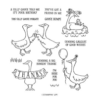
The Silly Goose stamp set is one that simply makes me Smile! The images are so darn cute. And the sentiments are perfect for a little humor. I believe this set is great for any age. My goose is white, which makes the coloring minimal. Even though I do love to color. All I had to do was match the hat and balloon to the DSP and it was ready to go.
Papers
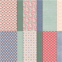
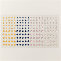
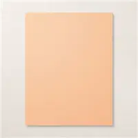
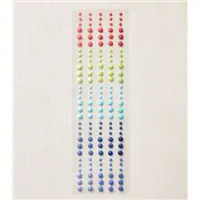
Finding a DSP that would look good with the goose was not a problem. Especially since it was a birthday card. This is from the Lovely In Linen Designer Series Paper in the Annual Catalog. I love the navy and red, with the softer of the Pale Papaya. Going with the softer color helped to pull it from the DSP. Then I added the Sweet Sorbet as the bright to highlight the goose. The navy came from the Milky Dots, which are a new favorite bling!!!
The focal layers can be any size needed. And I described the Cut in the first paragraph. For the DSP, take a piece that is the same size as the cut. That is 3 3/4 X 3 3/4. Cut it on the trimmer in a diamond shape to create the two triangles. The inside White is 4 X 5 1/4 and the triangle totally is placed flush on the white from the top corner, across and down. It does not reach all the way across, but that part is hidden when the card is closed. I added the white layer into the card and closed the front. Then the other half of the DSP is placed in the bottom left of the front with similar borders as the inside part you see.
Thanks for stopping in today!
HOST CODE
My March Host Code is ZF27VSFC. Please use this code for orders under $150.00. I will have a small gift for those with orders over $50.00 in addition to the Perk Rewards Program. You can read all of the information at the top of the page in the Menu Bar under SHOP / Perks.
Thank you for stopping by today. I hope you enjoyed today’s project and will come back. I do read and reply to all of the comments individually. They mean a lot to me. Please reach out if you have a question.
This month, our blog hop theme is Party Time! We hope you will be inspired by all the beautiful creations the Pals made for you! As you hop from blog to blog, we would love for you to leave a comment. You will find the lineup at the end of my post to help you “hop” along from Pal to Pal.
My card is definitely in the Party mode. I have paired some bright and fun papers with a perfect Cat-Cake. A cupcake with a cat !
Stamps
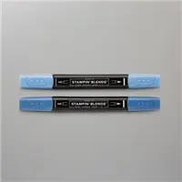
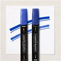
My Fat Cat cupcake is the best Party theme I can think of. And he looks very happy and proud of himself. You know how much I love to color. So the Best Day stamp set is my idea of a good time. This image is my favorite and I knew I had to have it the first time I saw it in the Mini Catalog. I do not currently have a gray cat in my hoard right now, but gray fit the bill the best. The image is stamped with Memento Tuxedo Black Ink and then colored with the same colors as are in the papers. All of the Stampin’ Blends used are in the Supply List as the bottom of the post.
Papers
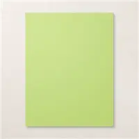
The papers used here are what determined the accessory colors for the Cat Cake. These are both from the Flowers & More Designer Series Paper. This is a Host Reward option in the Mini Catalog. I love bright and this fits that bill perfectly. For the card base I chose the brightest of all of the colors. The Parakeet Party is a bright and happy color for sure.
To match all of the brightness, I had to give my kitty cake some bling. With all of the colors I used, I found the purrrfect solution with the 2022-2024 Matte Dots. They are in the same bright colors. So instead of choosing, I just went wild and used a variety of color there as well.
Fun Fold
The reason for my finger in the first photo is that this is a Fun Fold also. I had to hold it flat to photograph better. Here is the open view. You can see that I used the stripes on all of the folds, with the bright mixed background as the inside back layer.
What you cannot see are two more striped pieces as well as the opposite of the cat layer. I have seen a variety of this fold and no one ever adds another writing spot. So I placed a blank white on the back of cat fold for writing. That way it is not exposed if someone wants to display your artwork.
Measurements
This card takes almost a full sheet of card stock. But it is well worth the sheet! The card base is 5 1/2 X 11. This leaves you with a strip that is 3 X 11. Cut that down to 3 X 6. Score that piece at 3 and fold in half. That is the cat layer. The card base is scored at 4, 5 3/4, 7 1/2, and 9 1/4. For me it is easier to make the many scores out to the right than up against the Simply Scored edge. Simply turn the card around and fold and burnish. You can refer to the photo to see how it folds.
The strips are four that are each cut to 1 1/2 X 5 1/4, and the inside back DSP is 3 3/4 X 5 1/4. You need three White layers if you add the extra as I did. They are all 2 3/4 X 2 3/4.
Thank you for visiting today!
More inspiration awaits, so use the lineup below to visit the rest of the Design Team. The Pals are excited to show you what they’ve created! Then, please mark your calendars for our next blog hop on April 12th, when our theme will be Flowers in the Garden, showcasing cards/projects with flowers.
My March Host Code is ZF27VSFC. Please use this code for orders under $150.00. I will have a small gift for those with orders over $50.00 in addition to the Perk Rewards Program. You can read all of the information at the top of the page in the Menu Bar under SHOP / Perks.
Thank you for stopping by today. I hope you enjoyed today’s project and will come back. I do read and reply to all of the comments individually. They mean a lot to me. Please reach out if you have a question.
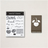
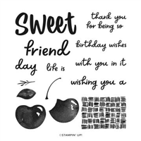
Bright and happy with a Cherry on top is the theme of today’s card. I have mixed fun designer paper with the Sweetest Cherry Bundle for you. It is definitely a Smile card!
Papers
I have to begin with the papers used on this card. The DSP is so pretty and seems like confetti raining down to me. This sheet is from the Flowers & More Designer Series paper from the Mini Catalog Host Rewards. I love all of the colors. And even though they do not totally match the cherry’s colors, they are all bright. For this card, that is all that matters.
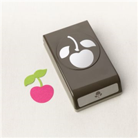
But that is not the star of the show. I have a close up of the cherry for you. It is definitely the star! I am not sure where the idea came from, but I used the In Color Glimmer paper for the cherry and the leaves. That is the best idea I have had in quite a while. Here is the close up…..
The glimmer is just enough to add a perfect shade to the Sweet Sorbet red for the cherry. And the Parakeet Party is equally as bright for the leaves. A perfect pairing in my book. Plus the little strip of the Parakeet Party gives just a bit more glimmer and ties the DSP and White piece together perfectly.
Stamps and Punches
The sentiment is from the Sweetest Cherry stamp set. I stamped it using both of the cherry colors, Sweet Sorbet and Parakeet Party. The brightness almost makes you think they are embossed.
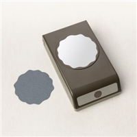
The Cherry punch used is part of the Sweetest Cherry Bundle. Because of using the Glimmer Paper I did not stamp the cherry. I did however add a layer of vellum behind the cherry just as something for it to hang on to. That is punched using the Decorative Circle Punch. For the final touch, I added one single Pearl to the cherry for the extra bit of highlight it deserves.
Thank you for stopping in today!
HOST CODE
My March Host Code is ZF27VSFC. Please use this code for orders under $150.00. I will have a small gift for those with orders over $50.00 in addition to the Perk Rewards Program. You can read all of the information at the top of the page in the Menu Bar under SHOP / Perks.
Thank you for stopping by today. I hope you enjoyed today’s project and will come back. I do read and reply to all of the comments individually. They mean a lot to me. Please reach out if you have a question.
Book Fold cards just seem to add a little extra to our creations. I love any Fun Fold, but this is a quick and easy one to do. There is a mixture of products on today’s card. That shows the flexibility of card making I believe.
Papers
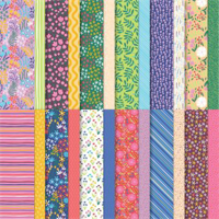
I will admit that this paper is from Sale-A-Bration. However, all of Stampin’ Up!’s papers are coordinated to where this card could be easily exchanged for different colors.
My card base is Fresh Freesia. It is odd that now that it is time for it to retire I have discovered how flexible it is and how much I love it! I paired it with Rich Razzleberry to pull the colors from the paper. These shades of purple are very different but work well together. I added to the pairing by using both the polka dot paper and the Rich Razzleberry as tags for the sentiment layer.
Stamps
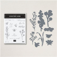
The sentiment and the stamped florals are from the Honeybee Home stamp set. Using colors from the papers, I colored both of the floral images with Stampin’ Blends. Since this is a fairly generic sentiment, and great for a lot of card giving reasons, I left the inside blank. Except that I added the flower again there. And I colored it the same as the one by the sentiment.
Dies and Punches
The flowers on the front of the card are cut using the matching Dies to the Honeybee Home Bundle. They are called Honeybee Blooms Dies. And the sentiment, which is from the stamp set, is cut using the Double Oval Punch. It seems a rare occasion that I do not use that punch!
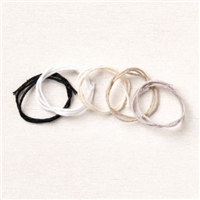
The tags anchoring the sentiment are both punched using the Essential Tag Punch. One is from the polka dot DSP and the other is the Rich Razzleberry card stock. They are overlapped and then finished with a bow from the Essential Baker’s Twine Pack in White. The last addition is one of the Brushed Brass Butterflies on the “book” spine.
Thank you for stopping by today!!
HOST CODE
My March Host Code is ZF27VSFC. Please use this code for orders under $150.00. I will have a small gift for those with orders over $50.00 in addition to the Perk Rewards Program. You can read all of the information at the top of the page in the Menu Bar under SHOP / Perks.
Thank you for stopping by today. I hope you enjoyed today’s project and will come back. I do read and reply to all of the comments individually. They mean a lot to me. Please reach out if you have a question.
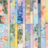
The card I have to share with you today is similar to the one from yesterday in that it is very floral. That is not something I do many of. In the case of today’s card, it is really all about the Paper! The Fancy Flora Designer Series paper is amazing in both colors and look of texture.
Paper
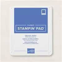
The look of textured paint along with the bright colors of this DSP is like looking at a piece of art! All of the sheets in this Fancy Flora Designer Series paper are like this. They are amazing and beautiful. For this card I wanted to show off as much of the paper as I could. So I opted for a couple of flowers and a simple sentiment. The first choice was what colors to pull from the DSP. I chose Orchid Oasis as the card base with a layer of Calypso Coral as a thin layer. And I love how it looks!
Stamps
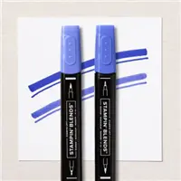
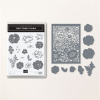
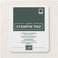
These two blue flowers may not quite look real. The blue was to pull from the paper and I love blue. So my card, my color of flowers. 🙂 These are from the Two Tone Flora Bundle. This stamp set has a few different sizes of flowers that are a two step stamping. And the Dies cut all of them. I used Orchid Oasis and Balmy Blue to create these gorgeous flowers. And the centers were colored using Calypso Coral Stampin’ Blends. For the leaves, I stamped with Evening Evergreen and then colored in the open areas with Soft Succulent Stampin’ Blends.
The single flower by the sentiment is one of a cluster that I simply cut one away from. I only wanted one for the sentiment. This sentiment is not in the Two Tone Flora set. It is actually from one of the SAB sets. It is the Beautifully Happy stamp set. If you do not have this set, there are many similar sentiments that would work perfectly here. I fussy cut around the words because I did not want a bulky sentiment layer to cover more of the DSP. The single strip of Calypso Coral, along with the little flower, was all I needed to ground the sentiment.
Finishes
Between the raised flowers and the look of texture on the DSP, this card did not really need a lot of extras. But I could not go without adding a touch of bling. So a few scattering of Basic Pearls was the choice I made. They give a bit more elegance to that gorgeous paper.
Thank you for stopping by today!
Don’t forget to check out the new Online Exclusives below. Click on the photo to be taken to my Online Store. And if you place an order, please use my host code just below that.
HOST CODE
My March Host Code is ZF27VSFC. Please use this code for orders under $150.00. I will have a small gift for those with orders over $50.00 in addition to the Perk Rewards Program. You can read all of the information at the top of the page in the Menu Bar under SHOP / Perks.
Thank you for stopping by today. I hope you enjoyed today’s project and will come back. I do read and reply to all of the comments individually. They mean a lot to me. Please reach out if you have a question.
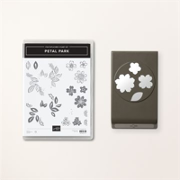
Today’s card is just a sweet card for anyone who needs Celebrating. We all can use that most days. This one is made with the Petal Park Bundle of beautiful flowers.
Stamps
The sweet flowers used in this card are from the Petal Park stamp set. And are cut using the Petal Park Punch. This is a two step stamp set. So the outline of the flowers and leaves are stamped using Memento Tuxedo Black Ink. I wanted them to really stand out against the darker background of the papers. The inside of the flowers are stamped using Calypso Coral and the leaves are Soft Succulent. The flowers are three on a single stamp. So this was only two stamping to get all of these flowers. I did stamp the first one full strength and then stamped again onto the second image without re-inking. I love the softer look and how they pair together.
The sentiments are from the Sentimental Park Stamp set. This set has a variety of “build your own sentiment” type stamps. Personally I love this! And to mix the fonts makes me really happy. That is one of the things I love about most of Stampin’ Up!’s sentiments is the mix of fonts in one sentiment.
Dies and Punches
To complete the Petal Park Punch comment, it matches both the flowers and the leaves. Just turn the punch over and look at the punch side to see how best to stamp your images to line up with the punch. For the flowers, having the two larger ones on the bottom works perfectly. The leaves are individual. So I had to stamp five leaves to get what I wanted. By looking at the bottom of the punch, I knew which direction to angle them to easily punch out.
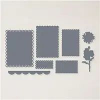
The sentiment layers are made with some of my favorite dies. These are both from the Scalloped Contours Dies. The scallops are in a few different sizes and the smaller white one fits a lot of sentiments and even stamped images. They are a staple to my Die Collection.
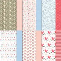
Paper and Colors
The beautiful, yet simple, DSP piece is from the Country Floral Designer Series Paper. It is one of the reverse sides. You know I love to use those lesser used papers. This one is pretty with soft colors that I wanted to highlight. My choice of the Calypso Coral , both full and stamped off strength is a shade darker than these flowers, but work wonderfully together. The card base is Mossy Meadow, which is a shade darker than the background. And the Mint Macaron scalloped layer is a shade lighter. All of the Stampin’ Up! colors really do work well together.
Thank you for dropping in today! I really do appreciate it.
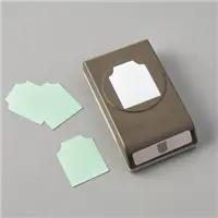
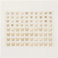
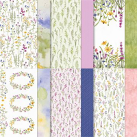
Online Exclusives Products now available…….
Stampin’ Up! has begun an Online Only product release. There are stamps, dies, bundles, kits, and 2 Circle Punches!!!
Click on the image to be taken to my online store to see all that is available. And if you place an order, please use my host code that is just below this image!
HOST CODE
My March Host Code is ZF27VSFC. Please use this code for orders under $150.00. I will have a small gift for those with orders over $50.00 in addition to the Perk Rewards Program. You can read all of the information at the top of the page in the Menu Bar under SHOP / Perks.
Thank you for stopping by today. I hope you enjoyed today’s project and will come back. I do read and reply to all of the comments individually. They mean a lot to me. Please reach out if you have a question.
The content in this blog is the sole responsibility of Jackie Beers as an Independent Stampin' Up! Demonstrator. The use of and content of classes, services or products offered is not endorsed by Stampin' Up!