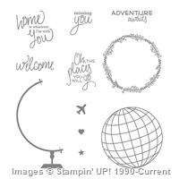
I absolutely love to travel! And I bought this stamp set to use with that in mind. I have to confess that this is the first time I have actually used it. Don’t you just hate that? Now that I have inked it up, I am in love. Talking about quick and easy!! Wow. A few stamps and you have a really cute card. And the stamp set is: “Places You’ll Go”.
Places You’ll Go
You really cannot tell from the picture, but the globe is layered. It gives the front just a little more definition. I wanted this to be a sweet card and I do like it. Isn’t it nice to have a card that uses only one stamp set. Sometimes it is difficult to do that!
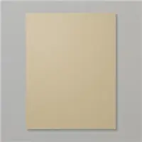
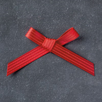
The base is Crumb Cake card stock cut to 4 1/2 X 11, scored at 5 1/2 and then the front folded under. This made for a great way to add ribbon and it not be wrapped on the inside of the card. I cut the ribbon, taped the two ends down on the back side of the crumb cake, and then took a short piece and just tied a not around the ribbon across the top. Easy Peasy!!
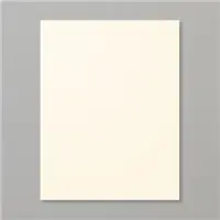
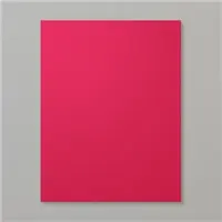
The Real Red layer is 3/4 X 4 3/8, and the Very Vanilla layer is 3 5/8 X 4 1/4. I like the smaller amount of red showing as opposed to the normal 1/4″ difference in layers. Remember that you will need a smaller than normal layer of Very Vanilla for the inside of the card. You do not want to see it around the edges of the red from the front. I used 3 1/2 X 4 for the inside.
Today’s card is a Patchwork card and this is a technique I have not done in quite a while. Fortunately it is also a technique that can be done in several different ways. I believe the way I chose has to be the simplest. I say that because I used scraps from a card I designed for my monthly Card Club last weekend.
The “You Are Amazing” is from the All Things Thanks set in the Occasions Catalog. That is a wonderful set for different ways of saying thank you.
You are Amazing, Stampin’ Up!, Jackie Beers Independent Demonstrator
Calypso Coral has been a favorite of mine since it was an In-Color several years ago. And when Mint Macaroon appeared it was like they were a match just meant to be together. The By the Shore Designer Series Paper is one you might overlook at first glance. But when you give it a chance and really look at the colors it is a must have. If by chance you are not into “beachy” kind of cards , just turn to the other side of the paper. It is wonderful.
Anyway, after cutting theBy the Shore DSP for my Club last week I had these little pieces left. I just could not throw these starfish and circles in the trash!! And there a card is born… A patchwork is what came of these poor little leftover pieces.
I don’t have the measurements for this and to those of you who love measurements, I apologize. But I just took them in the size they were and cut paper to fit. The only ones that I trimmed were the Mint Macaroon band and the bottom piece of Calypso Coral circles. The “You Are Amazing” is framed with the Stitched Shapes Framelits and Layering Ovals Framelits.
All Things Thanks, 143097, 19.00
By The Shore DSP, 141640, 11.00
Thank You for visiting my site. I hope you enjoyed this patchwork card.
I don’t know about you, but I believe Stampin’ Up! has the best Designer Series Paper. It is beautiful, coordinates perfectly, and is doubled sided. And I believe it is thicker than other designer papers as well.
For me, this stamp set was a bit of a sleeper. I immediately fell in love with the Designer Series Paper. What is not to love about the classiness of Navy? But the stamp set was so so. Until the first time I inked it up!!! OMG….. I love the variation in the flower. It is almost a faded look on parts of it. I remember stamping in about six different colors just to see how the variation looked in the different colors. It is a WOW!, at least to me. So here it is…..
This is actually a pretty quick card to make as there is very little stamping involved. Using this layout, which primarily uses DSP, you could make quick cards using your DSP scraps. That is definitely a Win/Win to me. I hope you will fall in love with this set like I did. I made a package of our note cards into Thank You cards for a friend. I used this set with Rich Razzleberry ink. Those were awesome !! I challenge you to try the different colors and let me know what you think.
The base is our Thick Whisper White Card Stock.
The Night of Navy layer = 5 1/4 X 4
The DSP layer = 5 X 1 1/4, and 5 X 2 1/2
The small Night of Navy layer = 3 1/2 X 2 1/2
The Whisper White layer = 3 3/8 X 2 3/8
The stamped layer is raised up with dimensional for an added interest.
Balloons are one of my favorite things. They just make me smile! And today’s card is one that hopefully would make anyone smile. It is also an alternate use for the Balloon Pop Up Dies. It is a tough call, but I think I like using the die cut better on the front than as a pop up for the inside. This way it gets your attention when you first see the card.
Isn’t that a Happy card? I love the touches of Rich Razzleberry. I know that Daffodil Delight and Rich Razzleberry are not your normal color combination, but I love it.
I cut the Whisper White card stock to 5 X 3 3/4 ( the width is the exact width of the die cut frame in case I wrote it down incorrectly ). I eyeballed the top and bottom placement as I put the card stock onto the die cut. It is actually more even in person than it appears on the picture!. This die cut is awesome in that it cuts extremely well and very easily pops out of the frame. That is a Yay to me!!
I used the balloon dies from the Thinlits set. However you can stamp them and cut out with the Balloon Bouquet punch from the Annual Catalog. I was playing around for what to put on the left hand balloon and just tried the circles from other balloons I had die cut. I liked that look so I went with it. I did use glue dots for the circles though. I was afraid that just a drop of glue might not hold well enough. The other two balloons are held down with the Fine Tip Glue Pen. As is the Rich Razzleberry bow.
The banner was so easy to line up since the stamps are photopolymer and you can see through them. I a loving that rubber more and more! Anyway, I stamped the outline of the banner and the saying onto Daffodil Delight Card stock and then hand cut it out. Unfortunately there is not a punch or die for that one. But it is very quick and easy to cut out.
The balloon section is raised with Dimensionals on each corner and the center and placed on the striped Daffodil Delight Designer Series Paper. The DSP is from the Brights DSP stack. Those color family stacks are so awesome! They are a little more expensive but you get 2 each of 2 different double sided designs of each of the 10 colors in a collection. It is so wonderful to just open that stack and find the perfect match for your card.
The items used today are:
Balloon Adventure Bundle, 144708, $53.00
Brights DSP Stack, 138434, $22.00
Thank You for stopping by !!!!! If you have any questions, please contact me. I would love to hear from you.
Today’s card is one of the quickest cards you can make. I keep telling myself to use my Designer Series Paper and it is so hard !! But this card is the kind of kick in the pants I need to actually use it. And truly, using a Festive (HaHa) DSP as the background is so easy. The fact that all the sheets coordinate is a super bonus. (Notice the strip behind the saying) And it gets an immediate smile from the recipient. Who could resist this paper?
The stamp set Confetti Celebration is definitely one that you need on your shelf. It is perfect for any type celebration. The sentiments are so versatile. For the front of the card I went with Time To Party. At least to me, it perfectly matches that paper. I colored the individual words with my Stamp n Write Markers to match the paper. The ovals are from Layering Ovals and the Stitched Frames.
As I said, this is a quick , but Smile worthy card. And as much as we want to keep our DSP, it is much more enjoyable to share it with others.
I was playing with watercoloring for a background and thinking of Valentine’s Day cards when this popped into my head. I just love those unexpected ideas! And I believe this one ended with success.
Watercolor Sheltering Tree
I used the Shimmery White Cardstock and my Aqua Painter to create the background. The picture doesn’t quite show the Soft Sky ink wash at the top, but you can see the Mint Macaroon and Pear Pizzaz pretty clearly. I wanted soft colors and these did the trick.
The tree is stamped in Tip Top Taupe with Flirty Flamingo buds. The sentiment and the enamel pieces are also Flirty Flamingo. I left the base card plain as well as the background layer. The layers and measurements are:
Base is Tip Top Taupe = 8 1/2 X 5 1/2
Flirty Flamingo Strip = 4 1/4 X 2
Mint Macaroon layer = 3 1/4 X 4 1/4
Shimmery White = 3 X 4
I was slow to use the Enamel Shapes, Much to my regret!! I have fallen for them and find myself reaching for them on a regular basis now. They come with two sizes of circles, hearts, and stars in each color. They are so great to add just a touch to a card. Or to cover up a booboo….. The next time you are ordering remember to look at these. I think you will love them and there are 40 of each color in a group. Another win/win.
This card is so quick and easy. It would be great for telling those we care about that we love them on any day or occasion.
This card has two sets used on it. The Sealed With Love from the Occasions Catalog and Your’e So Sweet from the Annual Catalog. The latter is a great set to have on hand. It can be used for a variety of occasions. I am most fond of the heart with “love” incorporated into it. I try to remember to stamp the front of my envelopes and the heart would be great for most any time. I think it tells the recipient that there is something special inside the envelope. At least I hope it does!
Here is today’s card:
You’re So Sweet, Stampin’ Up!, Jackie Beers Independent Demonstrator
The card base is Melon Mambo, which is one of my favorite colors. The Whisper White base layer is stamped randomly with two stamps from the Sealed With Love set and then embossed with the Happy Heart Embossing Folder. The heart layer is two stamped hearts from You’re So Sweet set and then the center one is a punched heart from the Brights Designer Series Paper Stack. The heart punch is called Sweetheart punch.
The color family paper stacks are a little more expensive but so very much worth the cost. You have every color in a family and a couple of different designs of each color. There is a color and design for many ideas and of course it coordinates perfectly with the card stock. A Win, Win !!
The card dimensions are:
Melon Mambo base = 8 1/2 X 5 1/2
Whisper White layer + 5 1/4 X 4
Melon Mambo small layer = 4 3/8 X 2 1/8
Whisper White heart layer = 4 1/4 X 2
The hearts layer and the polka dot heart are both popped up with dimensionals. I couldn’t get by without my dimensionals!
My card for today is from a FREE Sale-A-Bration set.Yes, I said FREE. don’t you just love that? From now through March 31, for every $50.00 you spend you get to choose one item from the special Sale-A-Bration catalog. There are a great stamp sets, along with ribbon, and designer series paper.
This card includes two sets from the SAB catalog: Tasty Trucks and Delicate Details.
Tasty Trucks, Delicate Details, Stampin’ Up!
I thought the different border stamps in the Delicate Details set were all lovely, but I needed a little whimsy for this card. So the wavy border was perfect for my vision. The set being in photopolymer makes it extremely easy to see through and line up the ends. I like the Smile factor this look gives my little truck. I stamped the border and truck in Archival Basic Black ink and colored the truck with our wonderful new Watercolor Pencils and a Blender pen. I know I have used these on most of the posts I have done, but they are just so much fun and so simple to use. They are the Cat’s Meow of my favorite tools right now! And yes I adore cats, and dogs!!
I started the card with a base of Daffodil Delight card stock and then a layer of Basic Black card stock. I did all of the stamping on Whisper White card stock. I needed something across the top because the Delicate Details border is longer than my 3 7/8 ends and I could not quickly decide how to make it meet. So I added a Pacific Point strip to mirror the blue stripe on the truck. To equal everything out I placed an Enamel Star on each end of the Pacific Point strip. I then used Brian King’s squint test and decided it needed an additional something. I then stamped “Congratulations” from the Tasty Truck set and punched it out with the Classic Label Punch. That was the finishing touch.
The measurements for this one are:
Basic card of 5 1/2 X 8
Basic Black is 5 1/4 X 4
Whisper White is 5 1/8 X 3 7/8
Pacific Point is 3/4 X 5 1/8
The products used are:
Sale-A-Bration: Tasty Trucks (143300)
Sale-A-Bration: Delicate Details (143314)
Occasions: Watercolor Pencils (141709)
Annual: Blender Pens (102845)
Annual: Enamel Shapes – Brights (141680)
Annual: Classic Label Punch (141491)
I had some technical difficulties, and mostly Operator Error on this post. Next time I will have the pictures and the links for easy access to my store. In the meantime you can click on Shop at the top of the page and enter the item numbers, or product name. I appreciate your patience as I learn this process!!
I love making cards, and I know that is stating the obvious! But I dislike having to make a sympathy card. I’m sure you all do as well. But once I have it completed I usually really like the finished product. I try to make them so that the recipient gets a little smile. We all need to smile and never more than during a sad time.
I probably should have thought the card out a little further, but I needed it quickly and so I grabbed the items on my desk. You will notice that the cardstock and DSP are the same as from the first post I made with Beautiful You. Please forgive that color repeat so soon after beginning this blogging journey. I needed to get this in the mail so I used what was out. And I really do love this color combination. Stampin’ Up! does such an awesome job on their designer paper. This one was a super hit when the current annual catalog debuted as it was on backorder for some time.
Remarkably You Sympathy, Stampin’ Up!, Jackie Beers Independent Demonstrator
I love the boldness of the flowers in the Remarkably You Stamp Set. The bold lines of the flower make it perfect for a stand alone image. I watercolored the flower with Stampin’ Up! Aqua Painter (watercolor pen) and ink from the lid of the ink pad. When I first tried this technique several years ago I was not very comfortable with the process of the outcome. But after playing with it, I have come to love doing it. There are several YouTube videos out there if you are not familiar with this technique.
The base of Melon Mambo is 5 1/2 X 8 1/2
The Pop of Pink Designer Series Paper is 5 1/4 X 4
The thin layer of Melon Mambo is 4 5/8 X 3 5/8
The Whisper White is 4 1/2 X 3 1/2
The sentiment is from the Flourishing Phrases stamp set. I always go for sentiments with mixed fonts, they are my favorite. I opted to place it directly onto the main panel (after much deliberation with myself!). I hope this is a layout, and even stamp set, you will use. With some added embellishments and a different sentiment, this layout works for any occasion.
The products I used are :
Remarkably You, 139894, $33.00
Flourishing Phrases stamp set, 141534, $37.00
Pop Of Pink DSP, 141648, $13.00
Melon Mambo Cardstock, 115320, $8.00
Basic Black Archival Ink, 140931, $7.00
Aqua Painter (2 pens), 103954, $17.00
Thank you for stopping by. I appreciate your comments very much.
This fabulous stamp set is definitely a keeper! The versatility of the lighthouse is just wonderful. I can see using it for everything, and when I first saw it I ignored it. Silly me !! After going through the Occasions Catalog several times, I really looked at it. The font is what really got my attention. Then it was “DUH”. It fits male, female, sympathy, birthday, inspirational, just everything. This set also works well with the Wetlands stamp set in the Annual Catalog also.
High Tide, Stampin’ Up!, Jackie Beers independent demonstrator
My favorite type of card is one that is pretty quick to complete. And even though this card has several colors it really only took a few minutes to come together. The base is Sahara Sand cut to 8 1/2 X 5 1/2. Marina Mist is the first layer at 5 1/4 X 4 followed by Whisper White at 5 X 3 3/4.
I know everyone begins there cards differently, but I started this one with the sand image at the bottom stamped in Crumb Cake. I then was able to place the lighthouse (which is a 2 step process) in the indention left by the sand. That was very thoughtful of the stamp designer, it makes placement so easy. I stamped the first, more basic ,lighthouse in Smoky Slate and then stamped over it with the second stamp in Basic Gray. It truly is easy to see through the photopolymer stamps to do this. I stamped the water image in Marina Mist and wondered should I have stamped it before the lighthouse. But I like the sort of shadow look the blank space leaves. The birds were stamped next in Smoky Slate. And I hate to admit it but I forgot to stamp the light shining out of the lighthouse until I had the layers taped together!! I just played down a piece of copy paper and stamped it. I was so proud of myself to think to do that!
The saying is stamped in Crumb Cake and layered on Marina Mist. I wanted it to pop a little more than stamping it directly on the white base layer.
Again, I know there are several colors and stamps used in this card, but please do not let that scare you away. I did this card with my Club and they all completed it pretty quickly.
The products that I used are:
High Tide, 143006, $26.00
Sahara Sand 8 1/2 X 11, 121043, $8.00
Marina Mist 8 1/2 X 11, 119682, $8.00
Marina Mist Inkpad, 126962, $6.50
Crumb Cake Ink, 126975, $6.50
Smoky Slate Ink, 131179, $6.50
Basic Gray Archival Stamp Pad, 140932, $7.00
Thank you for stopping by. Please let me know if you have any questions. I would love to see your comments as well.
The content in this blog is the sole responsibility of Jackie Beers as an Independent Stampin' Up! Demonstrator. The use of and content of classes, services or products offered is not endorsed by Stampin' Up!